#1 TYPOGRAPHIC SYSTEMS (4 WEEKS DURATION)
I need to sketch two options for each of the 8 typographic systems. It is optional for me to start doing it digitally in Adobe InDesign. The content of the design is the given text by my lecturer.
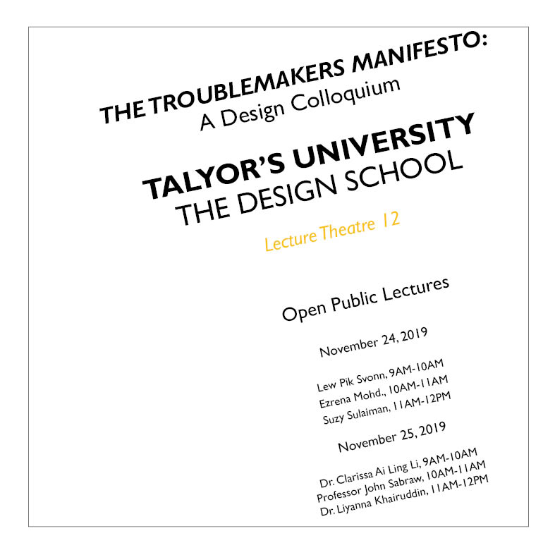
This is the information provided:
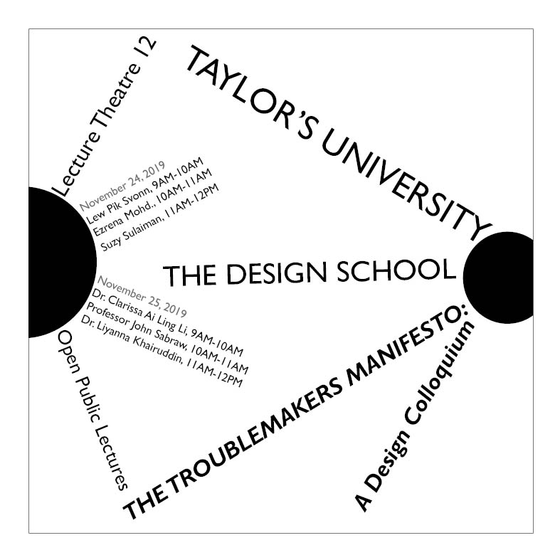
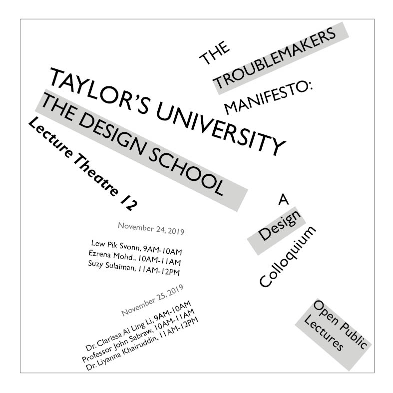
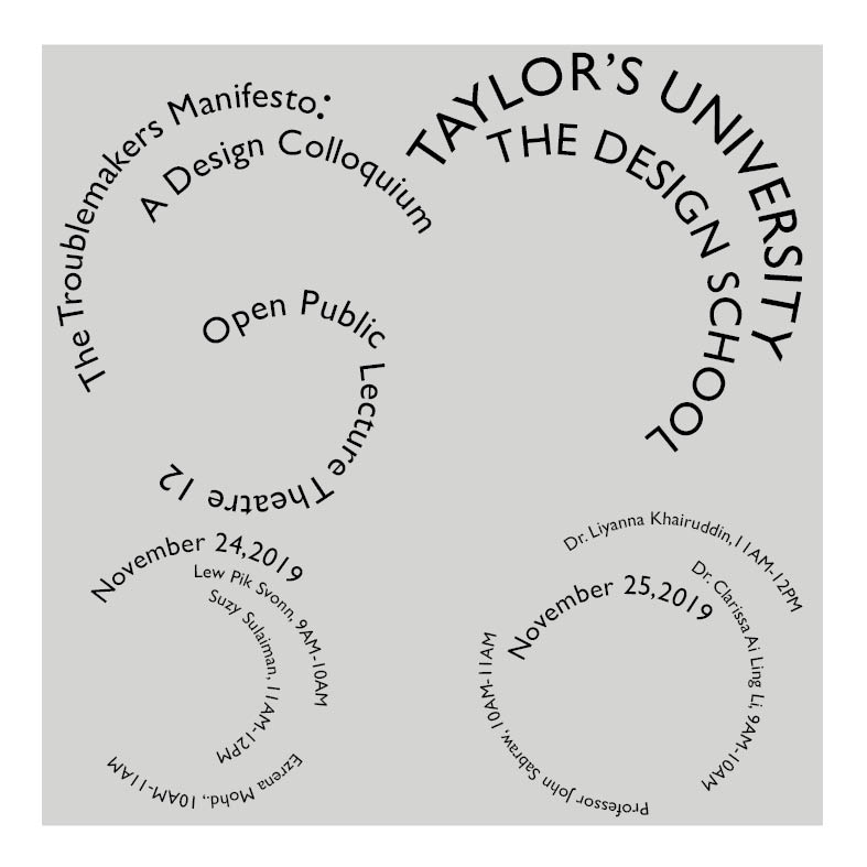
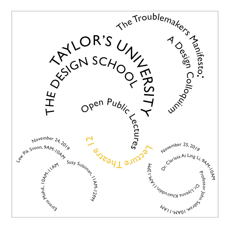
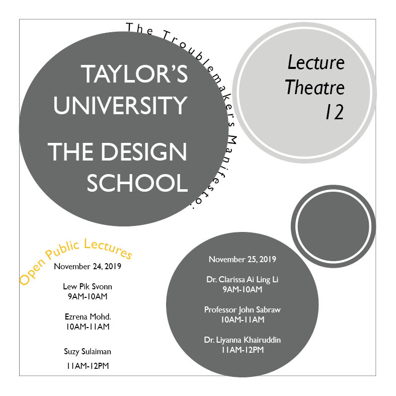
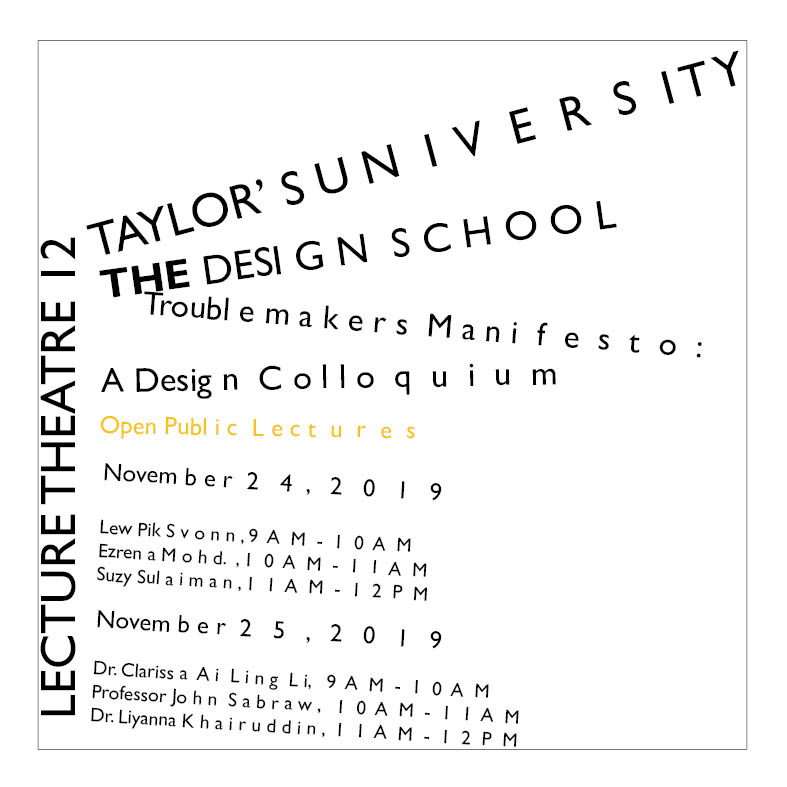
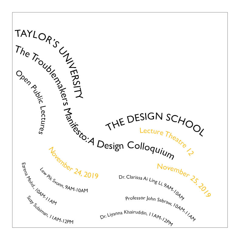
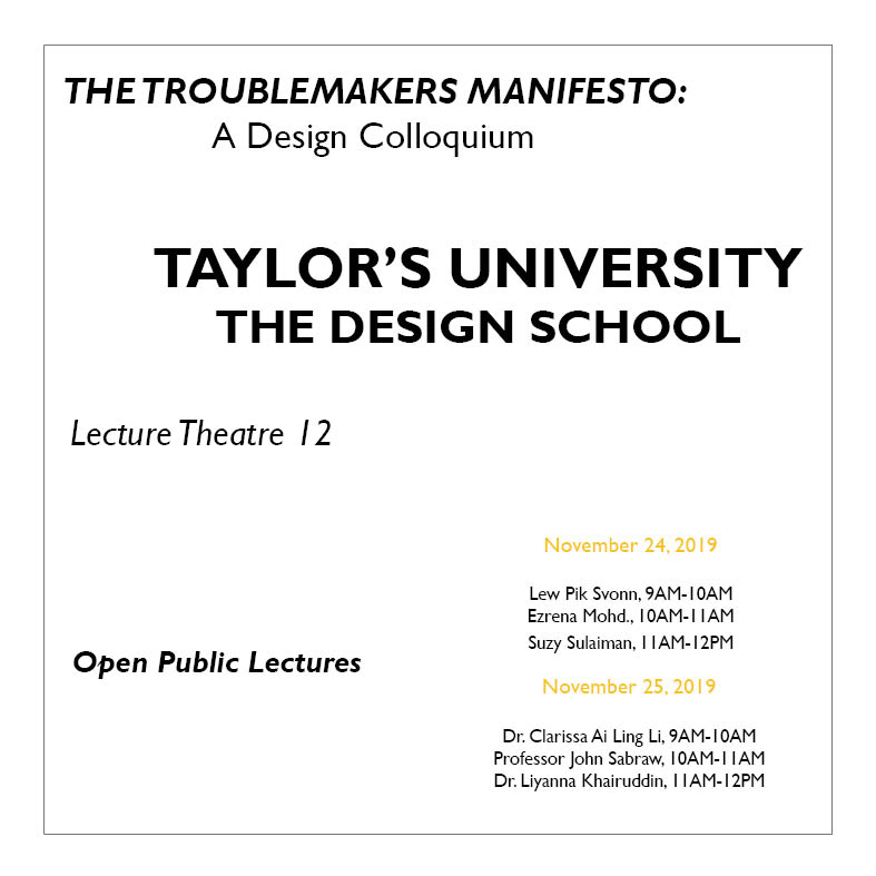
The Design School,Taylor’s University
The Troublemakers Manifesto: A Design Colloquium
Open Public Lectures:
November 24, 2019
Lew Pik Svonn, 9AM-10AM
Ezrena Mohd., 10AM-11AM
Suzy Sulaiman, 11AM-12PM
November 25, 2019
Dr. Clarissa Ai Ling Li, 9AM-10AM
Professor John Sabraw, 10AM-11AM
Dr. Liyanna Khairuddin, 11AM-12PM
Lecture Theatre 12
Sketches for the Typographic Systems:
andreaviechoong.com andreaviechoong.com
After sketching, we digitized in Adobe InDesign with a chosen typeface (Gill Sans MT) and used only black. I made some changes to the layout as some do not work well digitally.
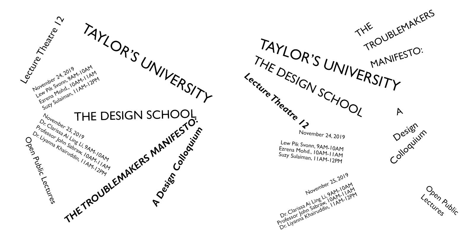
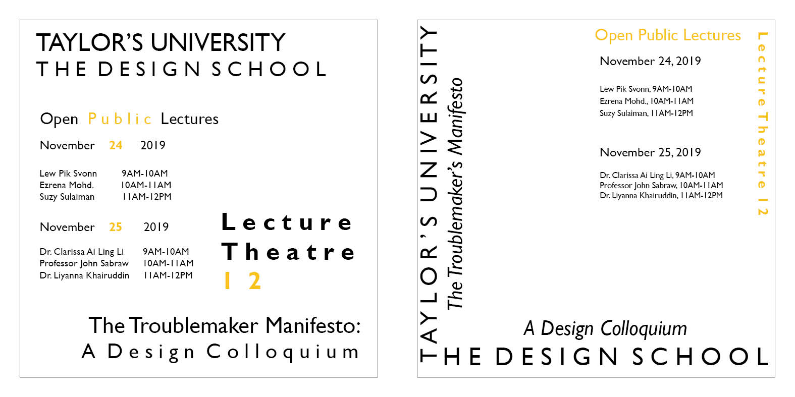
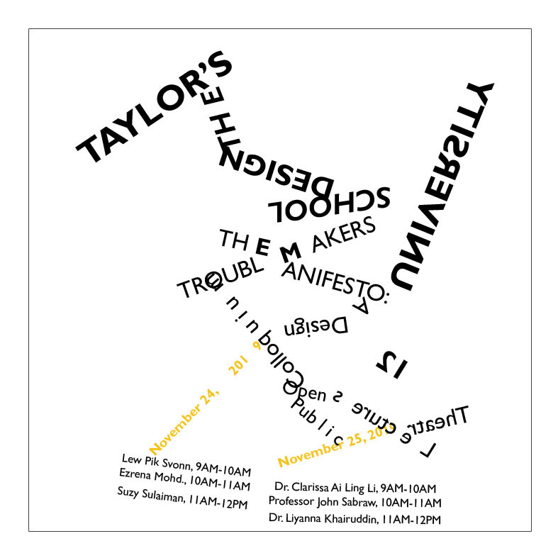
Initial Composition 1: Axial System
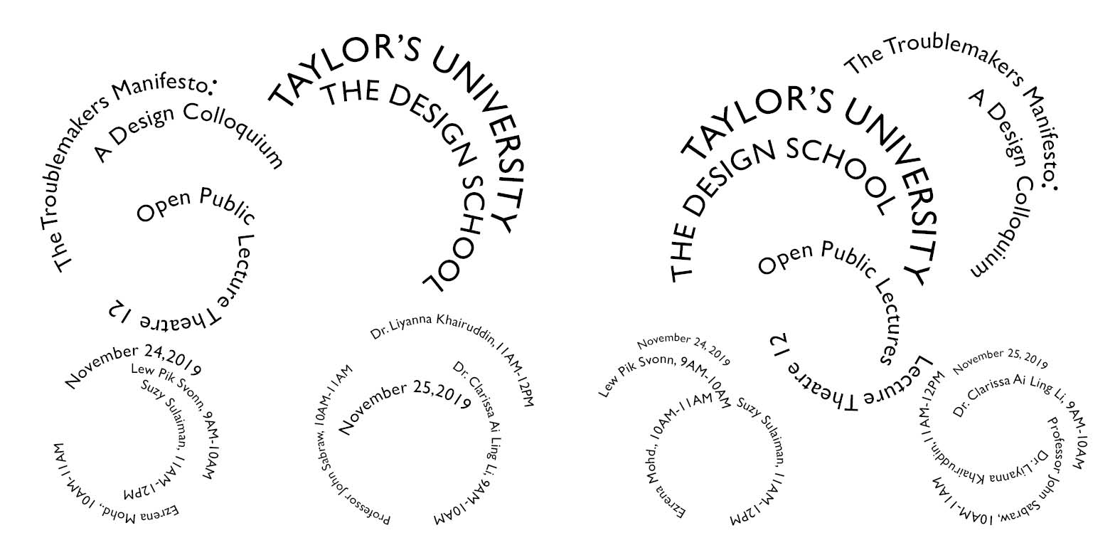
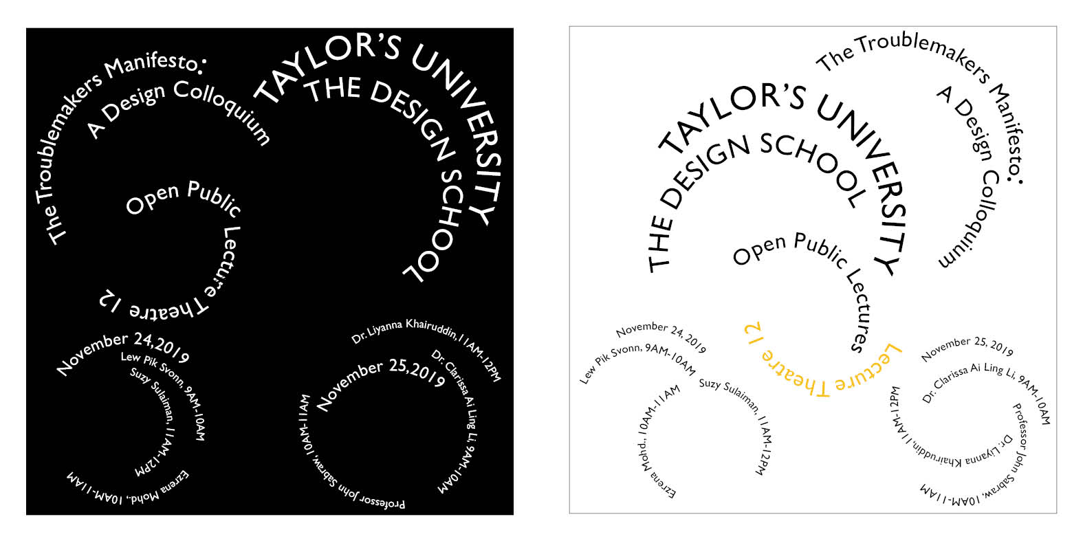
Initial Composition 1: Radial System
Initial Composition 1: Dilatational System
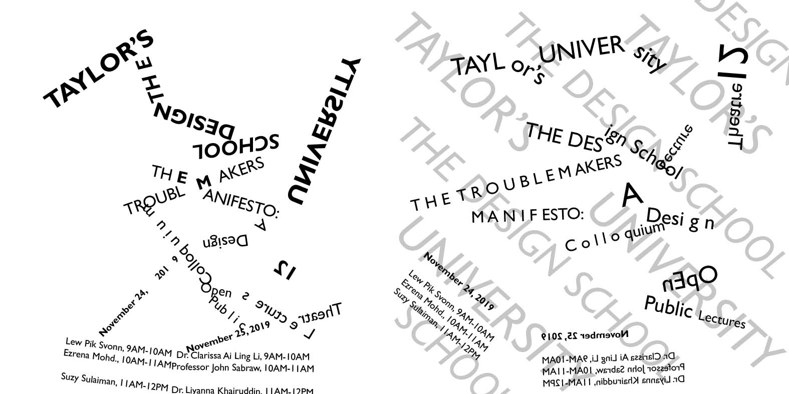
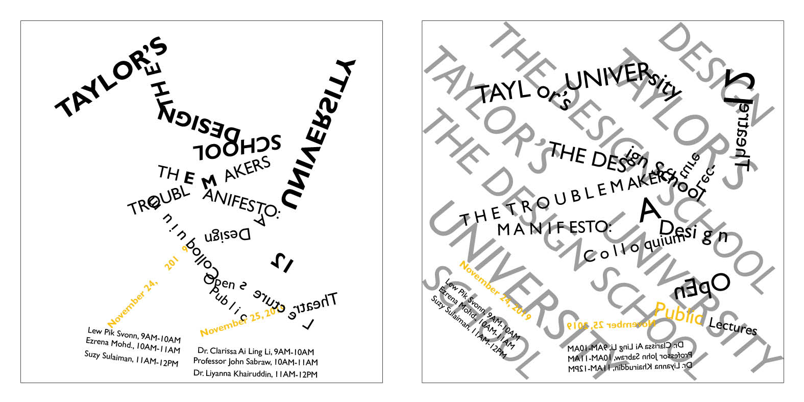
Initial Composition 1: Random System
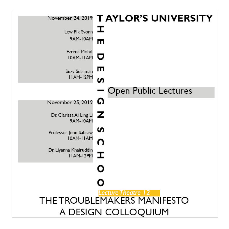
Initial Composition 1: Grid System
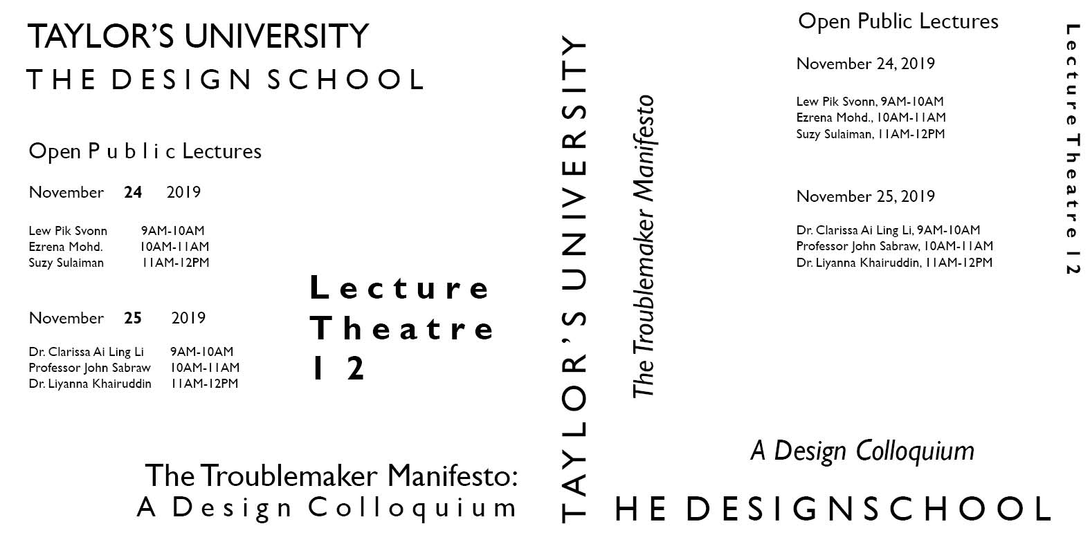
Initial Composition 1: Modular System
Initial composition 1: Transitional System
Initial composition 1: Bilateral System
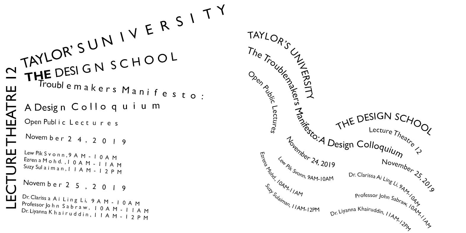
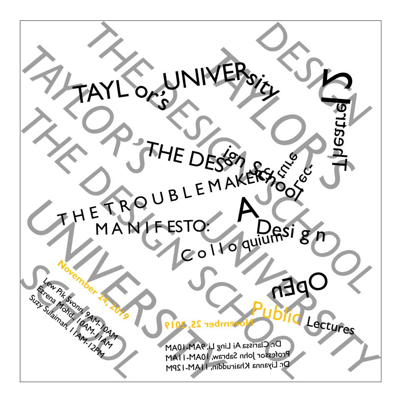
After getting feedback from my lecturers, I made some refinement to the paragraph spacing/leading as well as moving the information back into the margins. I added one colour and a few elements.
Initial composition 2: Axial System
Initial composition 2: Radial System
Initial composition 2: Dilatational System
Initial composition 2: Random System
Initial composition 2: Grid System
Initial composition 2: Modular System
Initial composition 2: Transitional System
Initial composition 2: Bilateral System
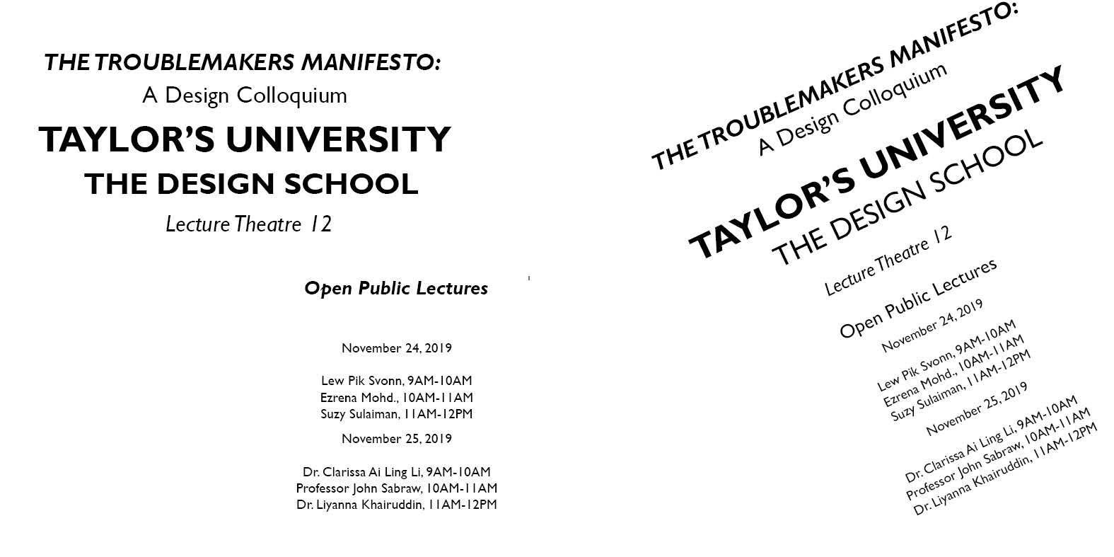
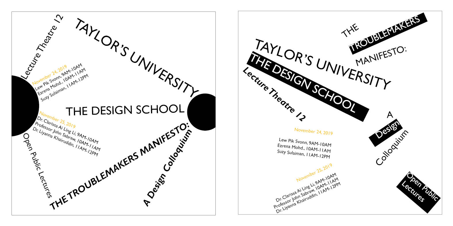
I made some adjustments to the layouts and here are the final compositions.
Final Composition: Axial System
Final Composition: Radial System
Final Composition: Dilatational System
Final Composition: Random System
Final Composition: Grid System
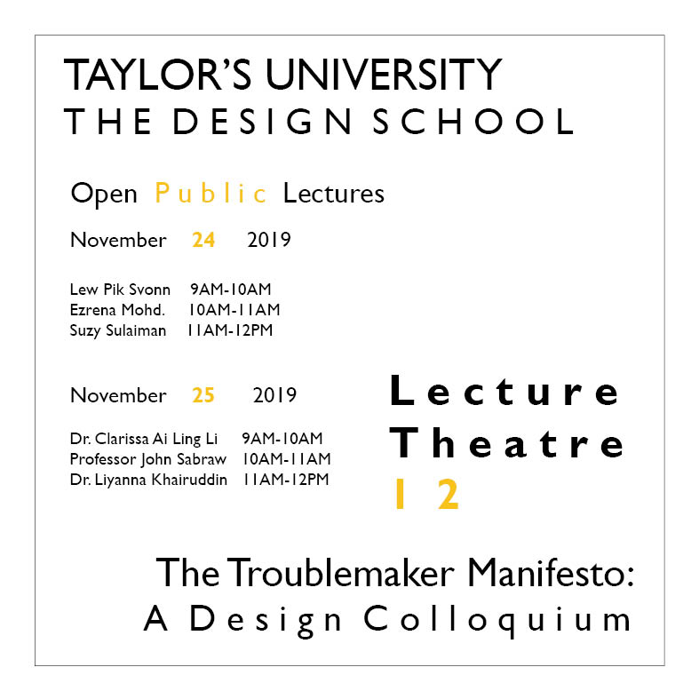
Final Composition: Modular System
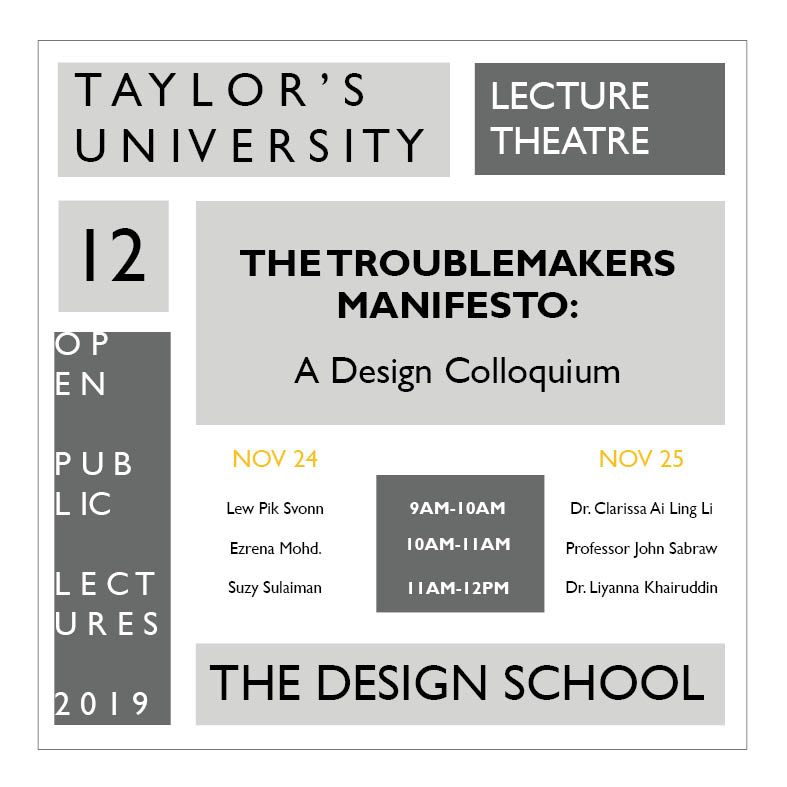
Final Composition: Transitional System
Final Composition: Bilateral System
#2: TYPE & PART (PART 1): FINDING TYPE (2 WEEKS DURATION)
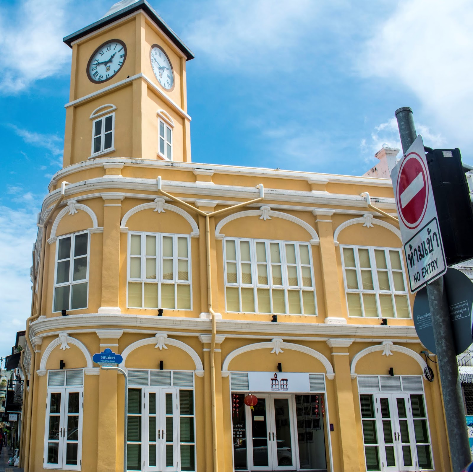
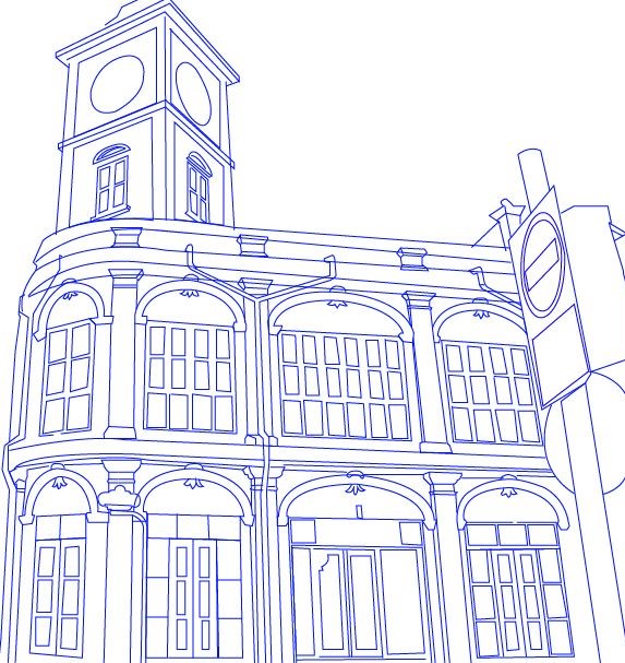
I was briefed on my next exercise of type&play. I had to choose a photo of either building structures, man-made objects or nature. I chose an image of a building that I took in Phuket Old Town last year.
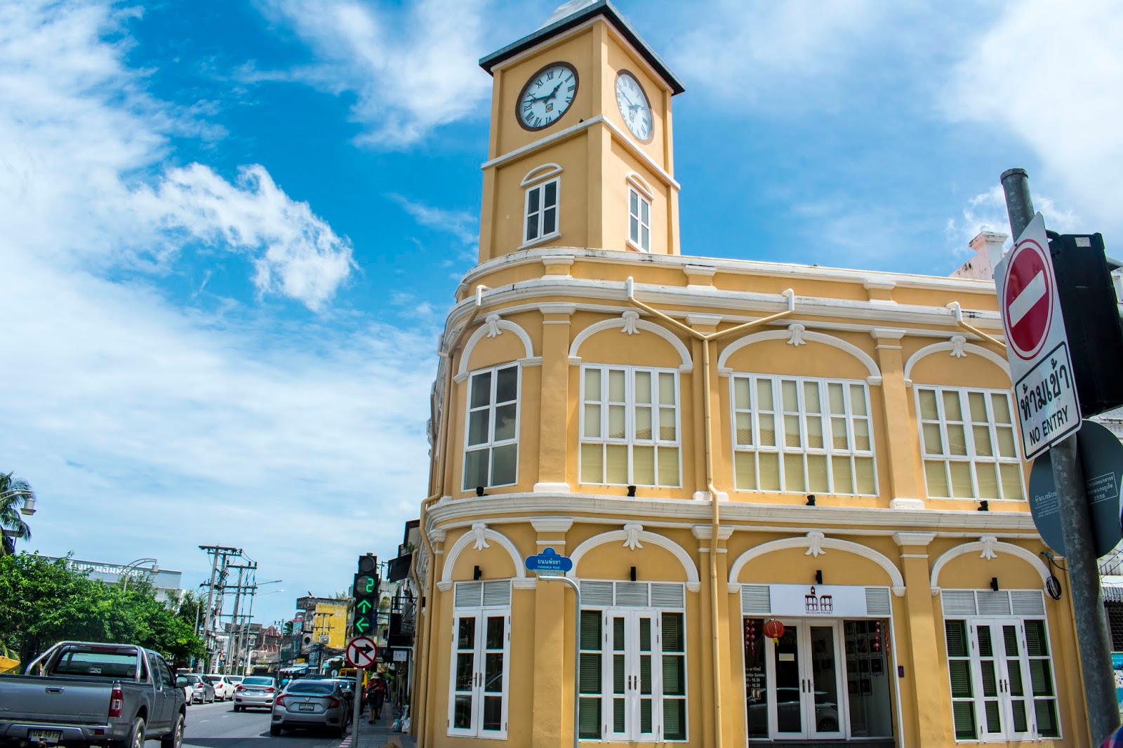
Here is the cropped image:
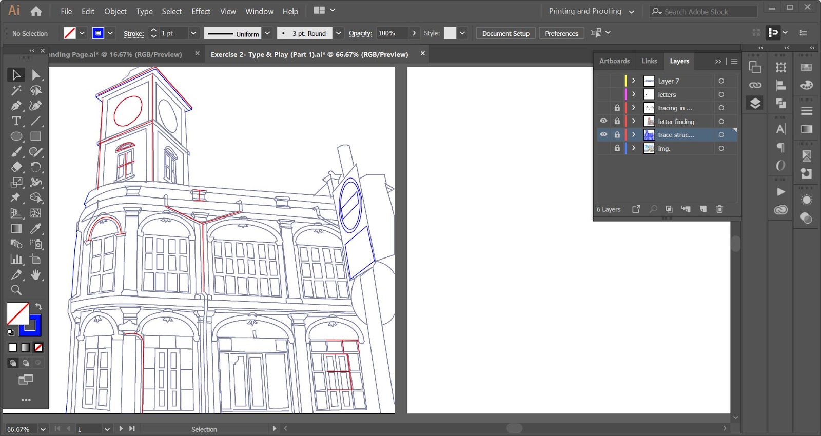
Then I had to trace the structure using lines or shapes. I planned to focus on the building.
Process of tracing the lines (outlines of the building structure)
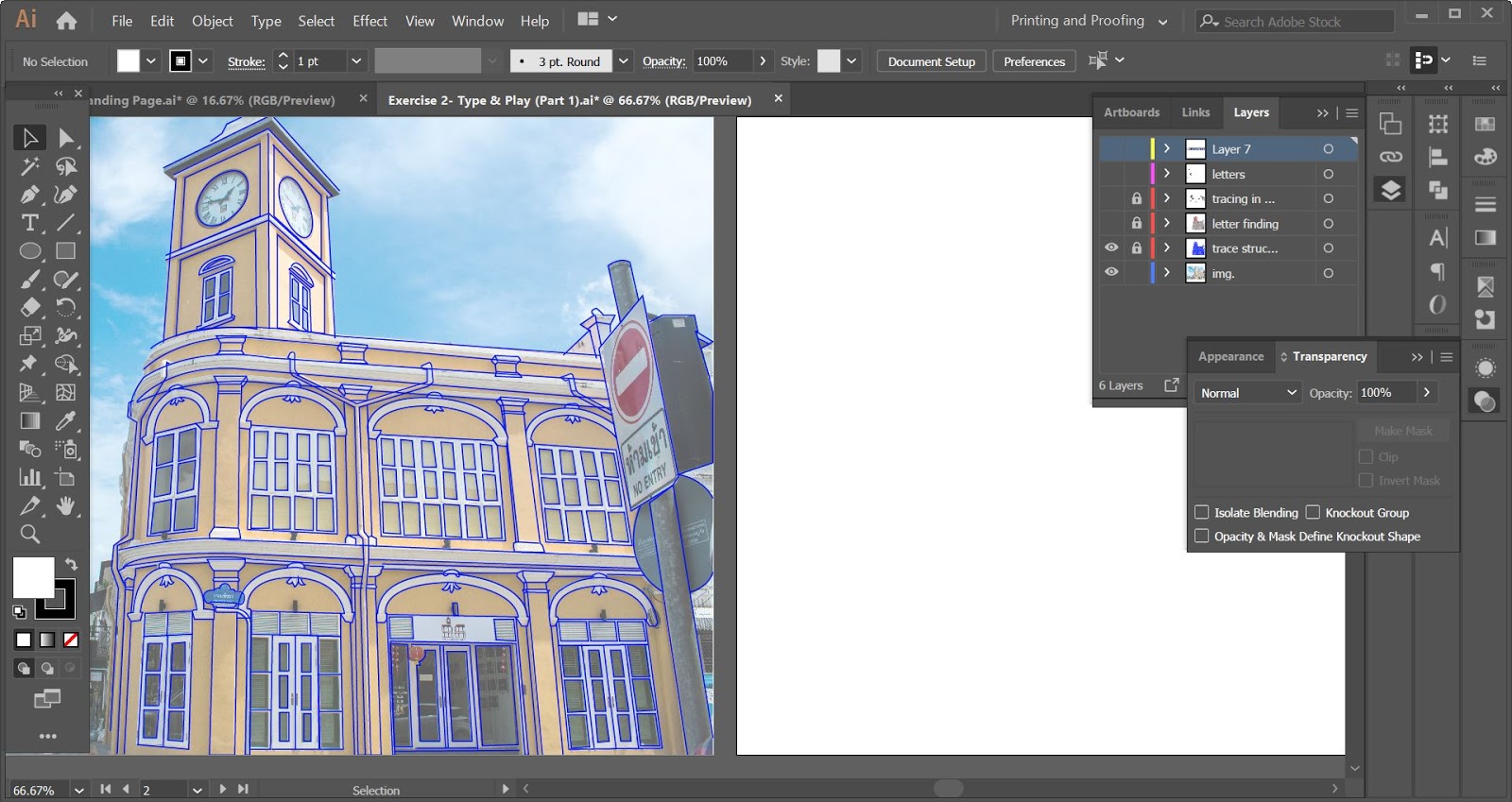
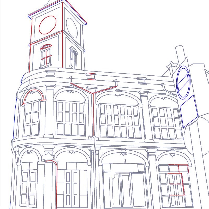
Image + Tracing (blue)
Tracing Lines (Without image)
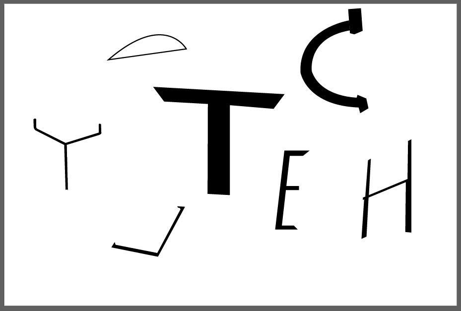
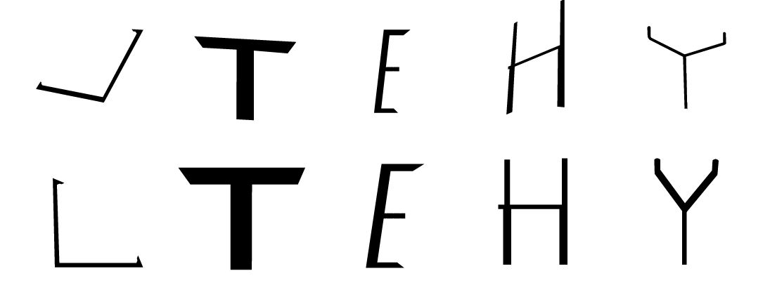
Then, I identified the letters based on the structure.
Process of identifying the letters from the lines
Highlight letters from the traced lines (red)
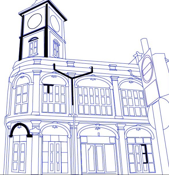
After that, I wanted to enhance the characteristics of the letters so I added some thickness and imitate the style seen on the building lines.
Adding style and character to the identified letters
Placing the letters on a blank artboard
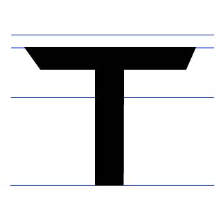
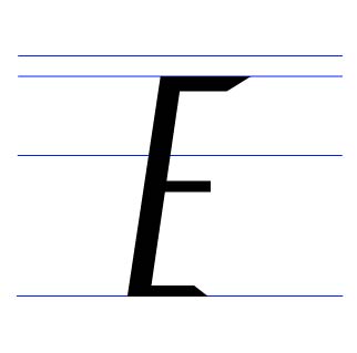
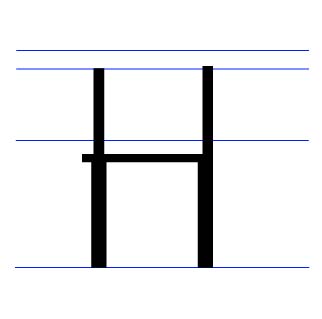
I refined the letters by adjusting their positions vertically and I added the baseline/x-height and cap-height guidelines to help refine my letters. I did the refinement on separate artboards.
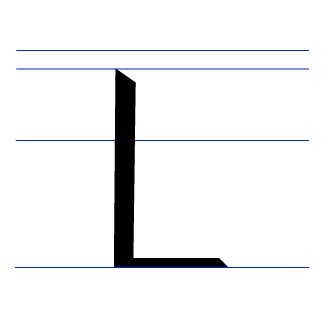
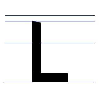
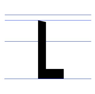
Refined Letter “L” (1st Attempt)
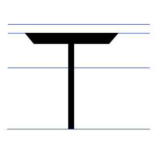
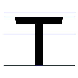
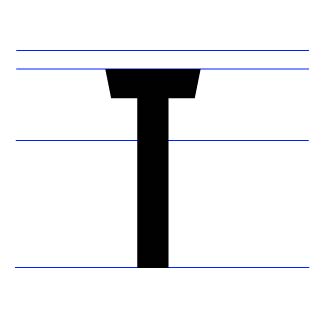
Refined Letter “T” (1st Attempt)
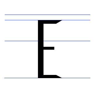
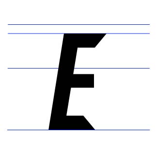
Refined Letter “E” (1st Attempt)
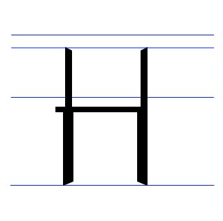
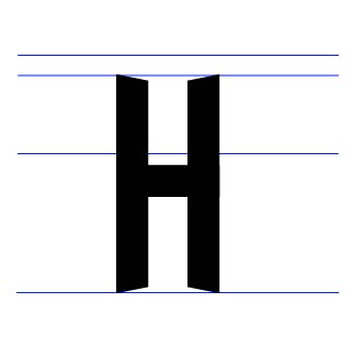
Refined Letter “H” (1st Attempt)
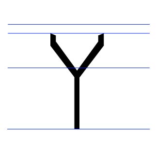
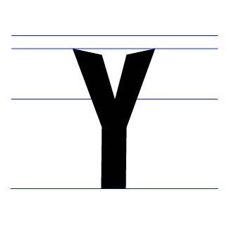
Refined Letter “Y” (1st Attempt)
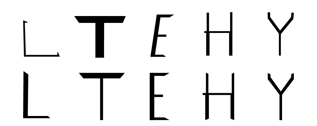
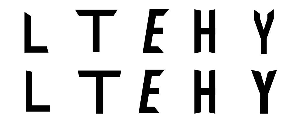
Before (Top) & After (Bottom) (1st Attempt)
After my first attempt of refinement, I felt that the letters would look better and organized if they had the same style. So I look for the similar thickness and shape of the letters and refine them more.
Refined Letter “L” (2nd Attempt)
Refined Letter “T” (2nd Attempt)
Refined Letter “E” (2nd Attempt)
Refined Letter “H” (2nd Attempt)
Refined Letter “Y”- 2nd Attempt
Before (Top) & After (Bottom)- 2st Attempt
After getting an online feedback, I had to adjust the thickness and moderation of the letters to make them look like they belong to one type family. And I had to use a typeface as a reference for further refinement.
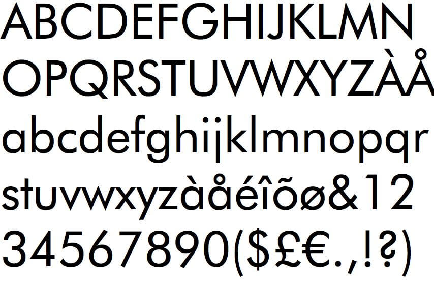
I chose two typefaces as references. The Bebas typeface is to refer to the thickness and Futured is to refer to the slanted edges.
Bebas typeface
Futura typeface
After feedback from my previous refinement, I had to adjust the slanted edges of the letters a little more.
Refined Letter “L”- 3rd Attempt
Refined Letter “T”- 3rd Attempt
Refined Letter “E”- 3rd Attempt

Refined Letter “H”- 3rd Attempt
Refined Letter “Y”- 3rd Attempt
Before (Top) & After (Bottom)- 3rd Attempt
After the feedback, I had to refine and adjust the thickness of the letters, L, T and Y to make it have the same thickness to the letter H.
Refined Letter “L”- Final
Refined Letter “T”- Final
Refined Letter “E”- Final
Refined Letter “H”- Final

Refined Letter “Y”- Final
Before (Top) & After (Bottom)- Final
#3: TYPE & PART (PART 2): FINDING TYPE (1 WEEK DURATION)
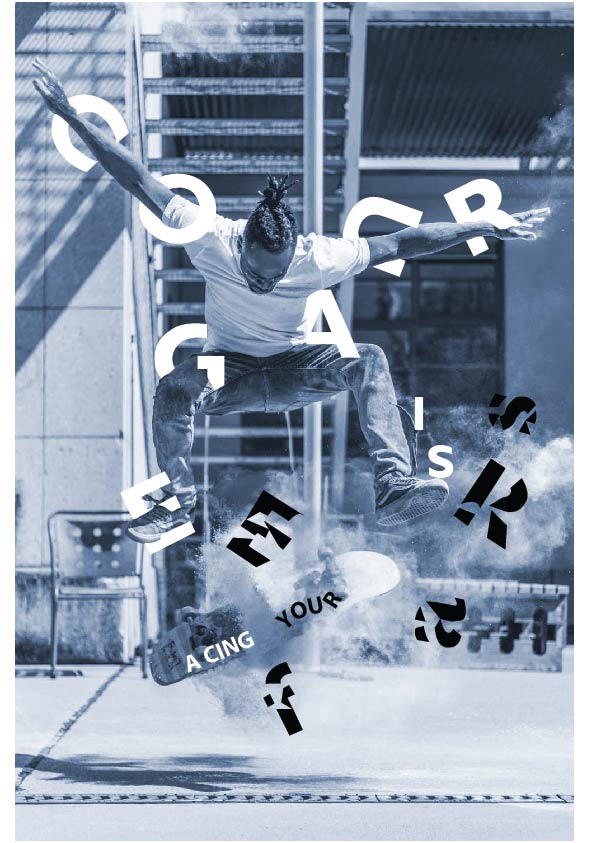
I had to choose a photo from the Internet that can be either man-made objects, buildings or nature. After choosing an image, I had to write about 4-5 words relating to the image and express it accordingly.
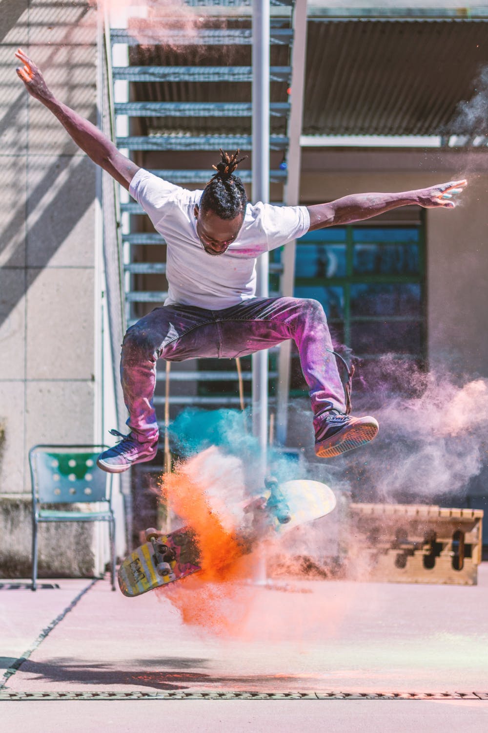
I found my quote/phrase in a website relating to skateboarding quotes. This is the website: https://www.theskateboarder.net/35-awesome-skateboarding-quotes/
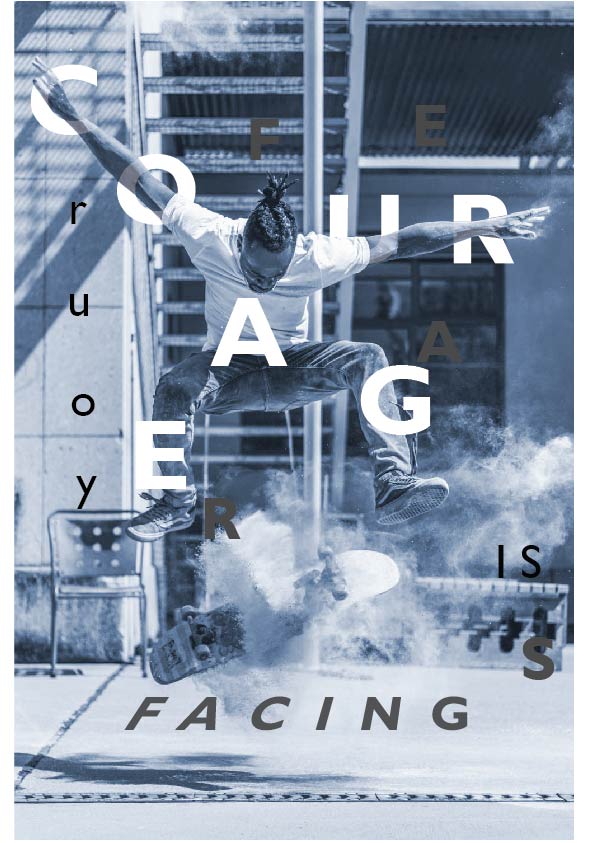
“Courage is facing your fears”
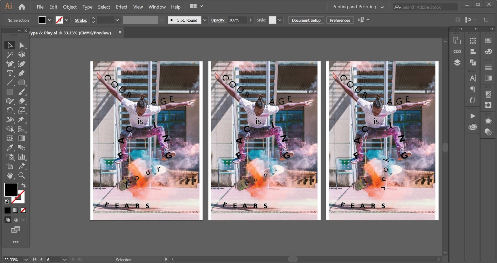
I tried out the words on the image to explore and figure out a suitable structure to enhance with the image.
Progress on exploring the typography positioning in the image
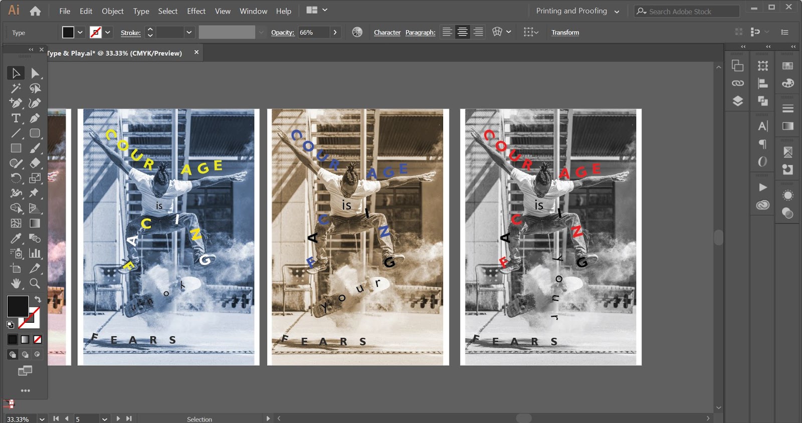
I wanted to focus on the words so I saturated the image and try out different colour schemes.
Progress of trying out different colour schemes
Progress on the composition- 1st attempt
andreaviechoong.com andreaviechoong.com
First attempt
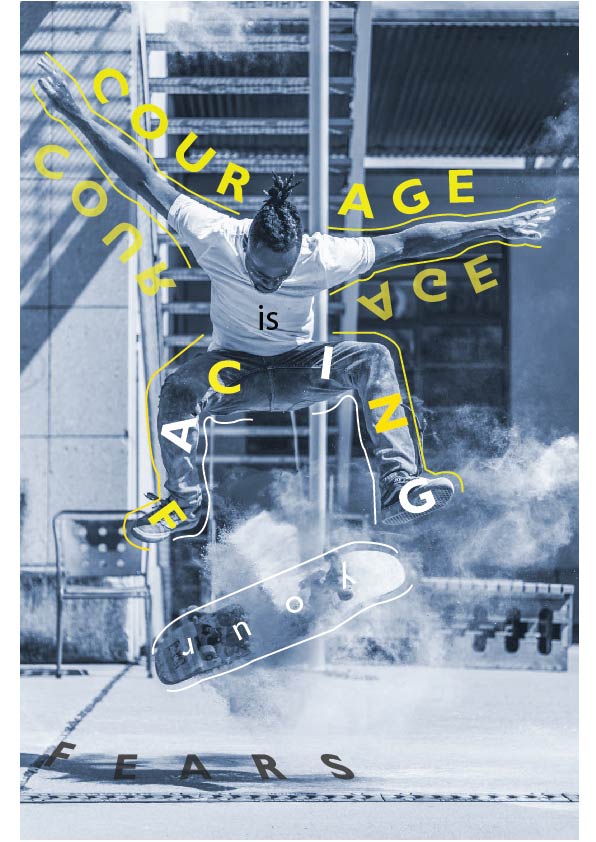
After getting feedback, Mr. Vinod said that it meets the criteria and purpose of the exercise but there needs to be more excitement and exploration.
I looked for references in Pinterest and Google to look for exciting composition in posters that are done by other designers.
Reference #1
Reference #2
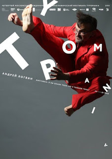
Reference #3
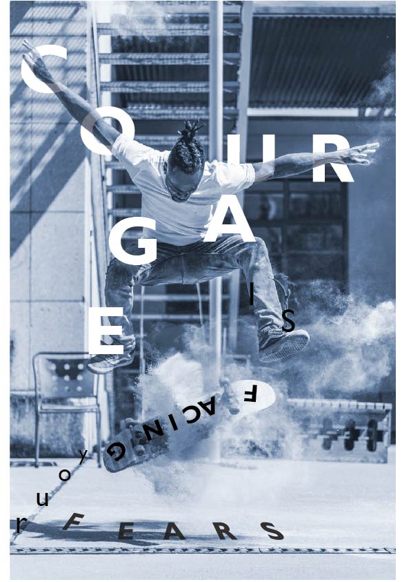
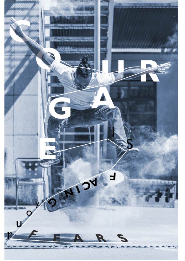
I decided to do more exploration with the words and make it more exciting by playing around the flow of the image and the text.
2nd attempt
3rd attempt
4th Attempt
Final Outcome