DESIGN, EXPLORATION & APPLICATION (4 WEEKS DURATION)
I was briefed on the final project and I am free to choose any topic as long as it has a purpose or a problem to solve. From this, I did some research and looked at other designers’ experimental typography and listed down some ideas.
- Alphabets made from strings
Purpose & reason: to teach children by interacting and constructing the letters themselves.
2. To transform the Braille alphabets to regular alphabets
Purpose & reason: to teach people about the alphabets that are used by the blind.
3. To enhance the typeface used in Ipoh Heritage Trial floor symbol
Purpose & reason: to enhance & show a better representation of Ipoh’s identity.
4. To enhance the typeface used in a café website
Purpose & reason: to create a better typeface that will suit with the website theme and concept.
5. To create a typeface using the Chinese temple construction symbols
Purpose & reason: to create appreciation of the construction of the temple
6. Improve a movie poster, Lion King
Purpose & reason: to enhance using the elements/concept of the Lion King to the movie typeface.
PDF of Idea Generations:
https://drive.google.com/file/d/1X8v6SY3HV3RzE3jE4sCBygOUUKKz2GNk/view?usp=sharing
After many thoughts, I decided to go ahead with Idea 3 as I was more interested in that idea at first. So I decided to develop that idea with more inspirations and references that will help me be clear of what I want to produce and achieve.
Presentation Slides of Final Idea:
While the development of the typeface is based on Ipoh’s heritage, I looked for images that best represent it. I have photos of some of the significant buildings that relate to heritage so I decided to study the structure and design of those buildings and what makes them considered to be the heritage of Ipoh.
Dewan Bandaran Ipoh (Ipoh Town Hall & Old Post Office)

Birch Memorial Clock Tower

Mahkamah Tinggi Ipoh
Ipoh Railway Station

From my observation, I found that most of these buildings have similar designs especially the pillars.
Similar design style found on the heritage buildings (indicated in red)
So I decided to use these designs when creating my typeface for the letters. I explore two different variations using the letter H. I used a sans-serif font, Arial as a guideline to build my letter.
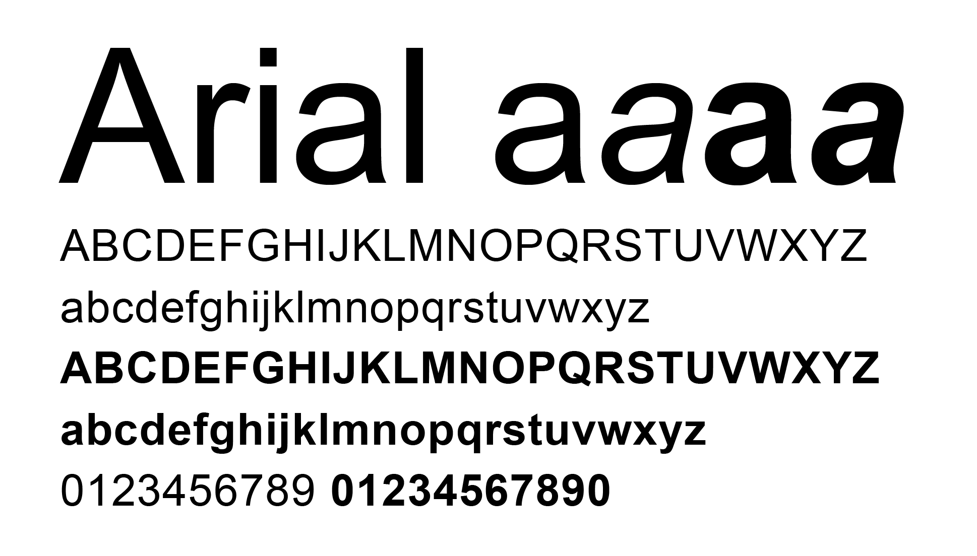
Two different variations of letter H
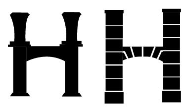
I decided to go ahead with the second variation as it looks more unique and suitable and shows more of the representation of the Heritage buildings in Ipoh. I continue using this style to create some alphabets.
I did some sketches of the alphabets before doing it digital in Adobe Illustrator.
Left: Letter H- initial sketch, Right: Letters B, Z, R, Y, S, K, L, G- developing sketches

Second Variation: Letters A-F (1st attempt)
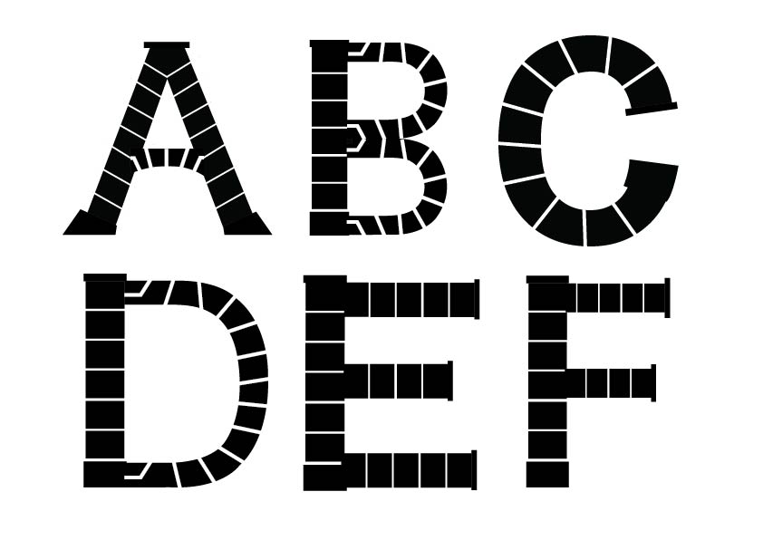
Second Variation: Letters G-L (1st attempt)
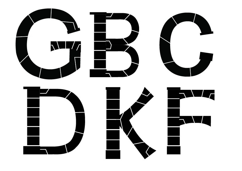
After I received feedback, I had to refer to a normal Roman typeface especially for letter B and D. I had to refine and change the thickness of the lines on my letters by making it consistent. Besides that, I need to reduce the number of lines as it looks over complicated.
Another chosen Roman typeface (Bembo Regular)

I observe at the building structures again to make sure I do not forget about implementing the design style to the letters. I reduced the number of lines and adjusted some parts of the letters to make it look similar and consistent with each other.
Second Variation: Letters G, B, C, D, K, F (2nd attempt)
After refining some of the letters, it seems to look more better than the previous attempt. I continued to refine them further before finalizing with the other letters as well.
Process of arranging the alphabets A-Z in AI (3rd attempt)
After the feedback, I refined my letters further in reducing more of the white lines and maintain consistency in each of the letters.
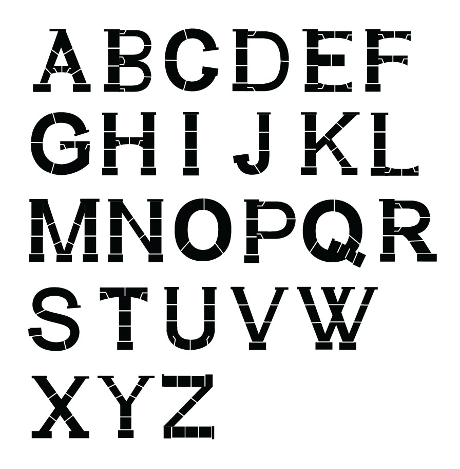
Final Outcome of Typeface: Alphabets A-Z
Final Outcome of Typeface: Ipoh Heritage
After designing the letters from A to Z, I decided to make a short animated GIF of how the Ipoh heritage building are made from the beginning with layers of concrete to a beautiful majestic white building. The night sky colour scheme is to show the contrast of the white building letters.
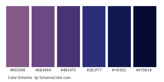
I looked for colour scheme that I will use in my animated GIF.
Colour Scheme for animated GIF
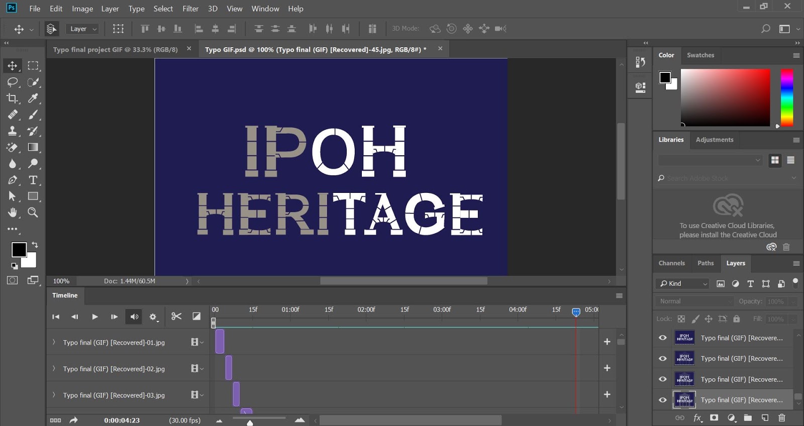
I made each frame in separate artboards in Adobe Illustrator and then export it to Adobe Photoshop to create a timeline for the short animated GIF.
Process of making artboard in Adobe Illustrator (1st attempt)
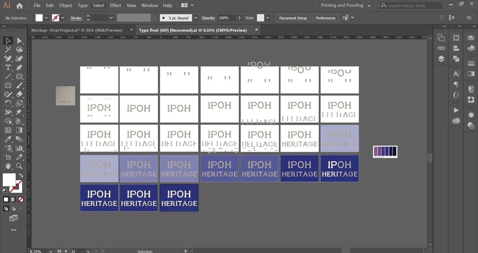
Process of editing the timeline to create the animated GIF in Adobe Photoshop (1st attempt)

I made the animated GIF again with the new refined letters and changed the animated GIF a little bit by adding the transparent illustrated heritage building of the Ipoh Town Hall to reflect on the typeface and the word “Ipoh Heritage“.
Process of creating artboards (in Adobe Illustrator)
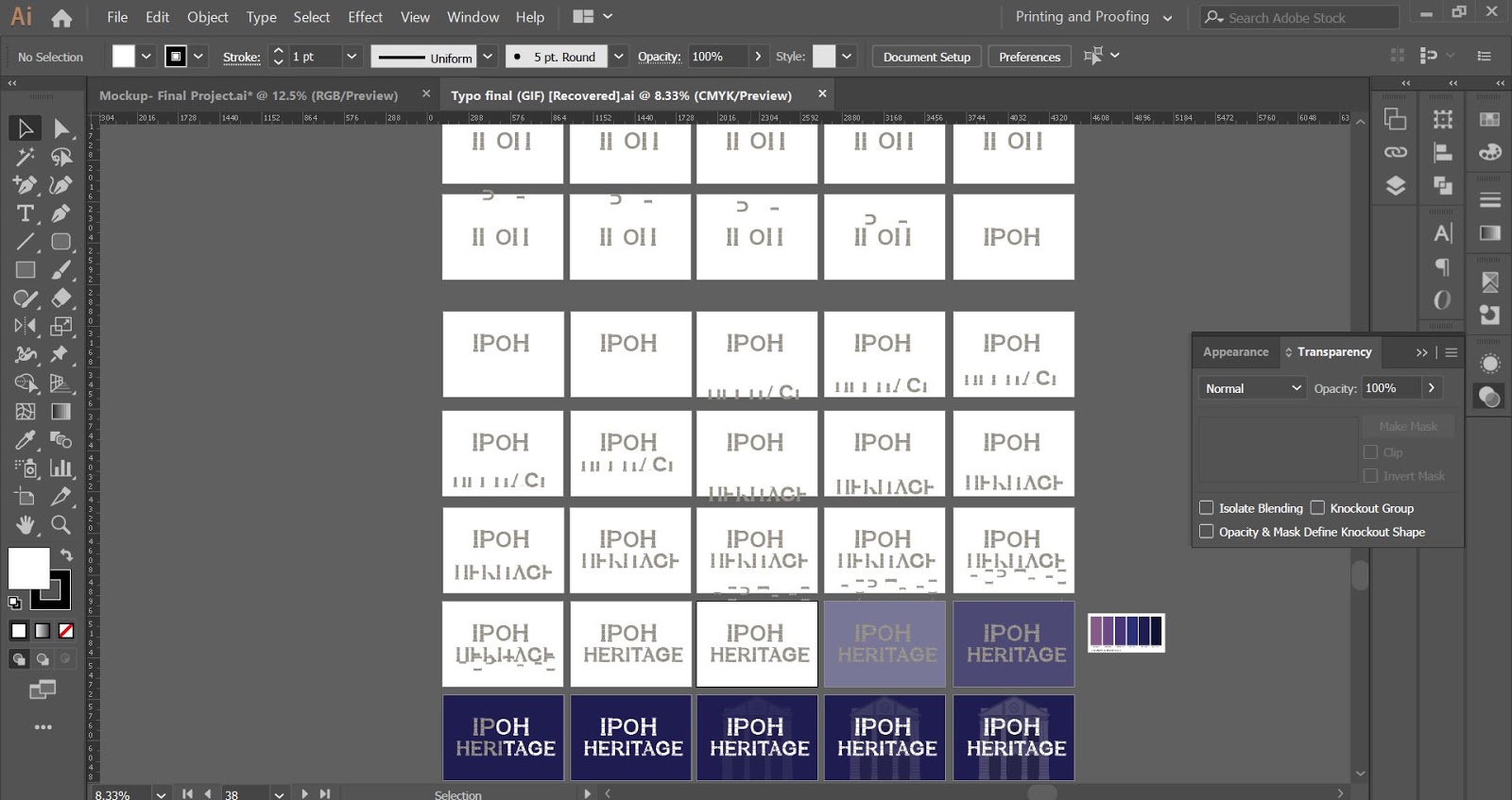
Process of editing timeline for animated GIF (in Adobe Photoshop)
Animated GIF of “Ipoh Heritage” typeface (1st attempt)

I wanted to make the last frame which is the final outcome appear longer as that is the purpose of the animated GIF.
Animated GIF of “Ipoh Heritage” typeface (2nd attempt)
I noticed that the heritage looks staggered almost near the end of the GIF so I edited again and make the animation a little more slower.
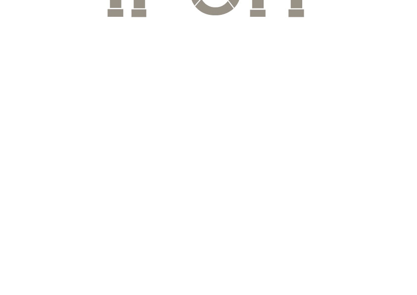
Final Animated GIF of “Ipoh Heritage” typeface