#1 CALLIGRAPHY (3 WEEKS DURATION)
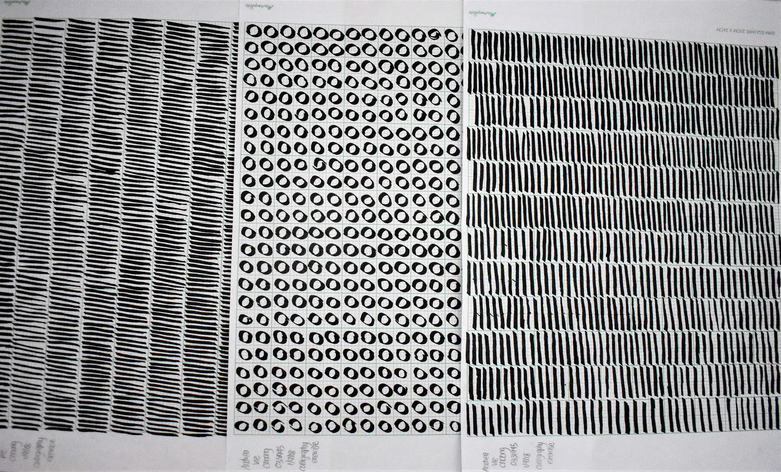
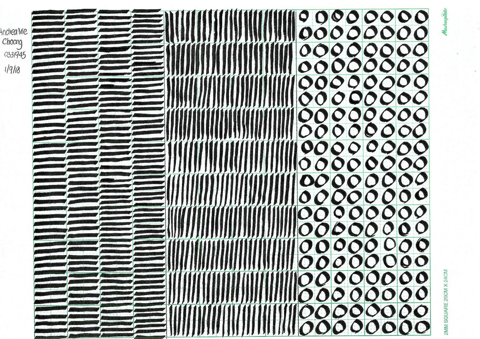
In this week’s class as homework, I was asked to draw out vertical, horizontal lines and circular lines on a graph paper using an Artline 3.0 calligraphy pen. The aim of this exercise was to get used to my calligraphy pens and to have constant strokes all the way.
Here is a complication of my process of trying out the calligraphy strokes on rough papers.
After getting used to drawing these strokes, I did a first and second attempt combining all three types of strokes on one paper.
1st Attempt:
2nd Attempt:
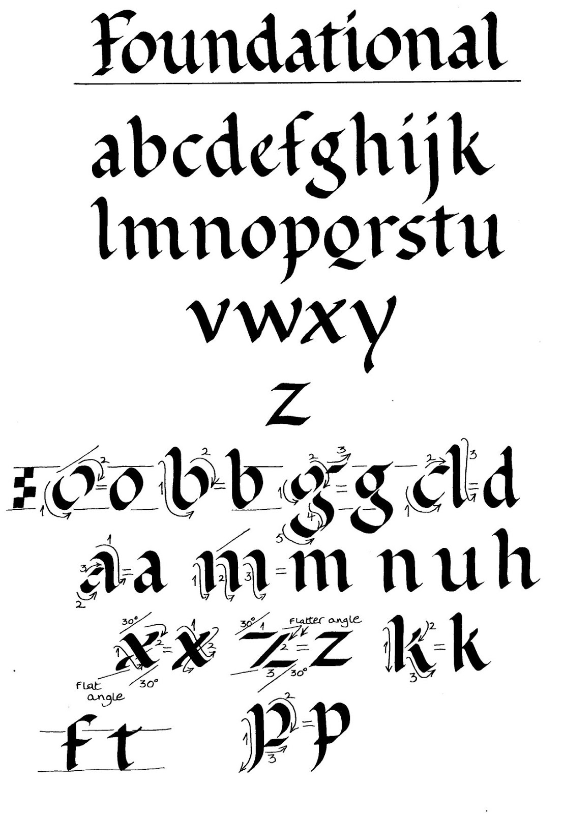
After completing this exercise, we moved on to choosing our chosen hand that we are comfortable with the most. I chose the Roundhand foundation as I prefer to write with this hand.
Chosen hand: Roundhand foundation
Practice Process of Alphabets using the chosen hand
Final Outcome of Alphabets A-Z:
andreaviechoong.com andreaviechoong.com
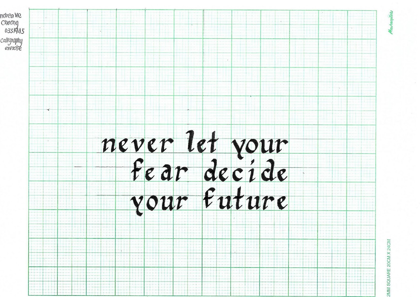
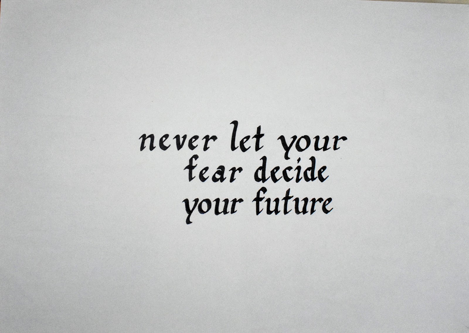
After drilling on the alphabets of our chosen hand, we moved on to writing our favorite quote or saying that we like it. I chose a quote relating to fear. “Never let your fear decide your future“. I had to present the quote with an equal division between each line.
Practicing on graph paper:
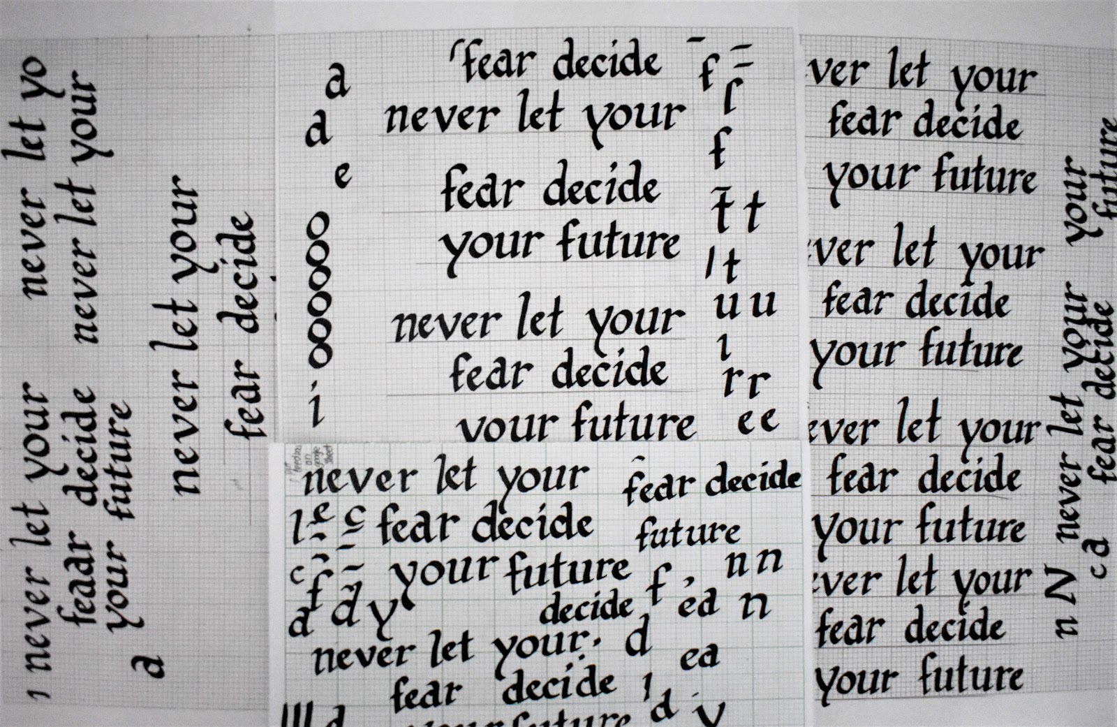
Practicing on A4 paper:
Final Outcome of Quote (Graph Paper):
1st & 2nd Attempt Quote (A4 Paper):
andreaviechoong.com andreaviechoong.com
Final Outcome of Quote (A4 Paper):
#2 ANIMATED LETTERING (2 WEEKS DURATION)
For this exercise, I had to design five different styles of lettering of my own name. We only need to choose one word to describe ourselves. After choosing one style, we will animate a gif for that lettering style using Adobe Photoshop and Adobe Illustrator.
I chose “unique” as a word to describe myself. Being unique to me is being different and distinctive from everyone else. There is only a person like me in this world. I drew out five different styles to relate to the word “unique“.
Sketch exploration of lettering styles
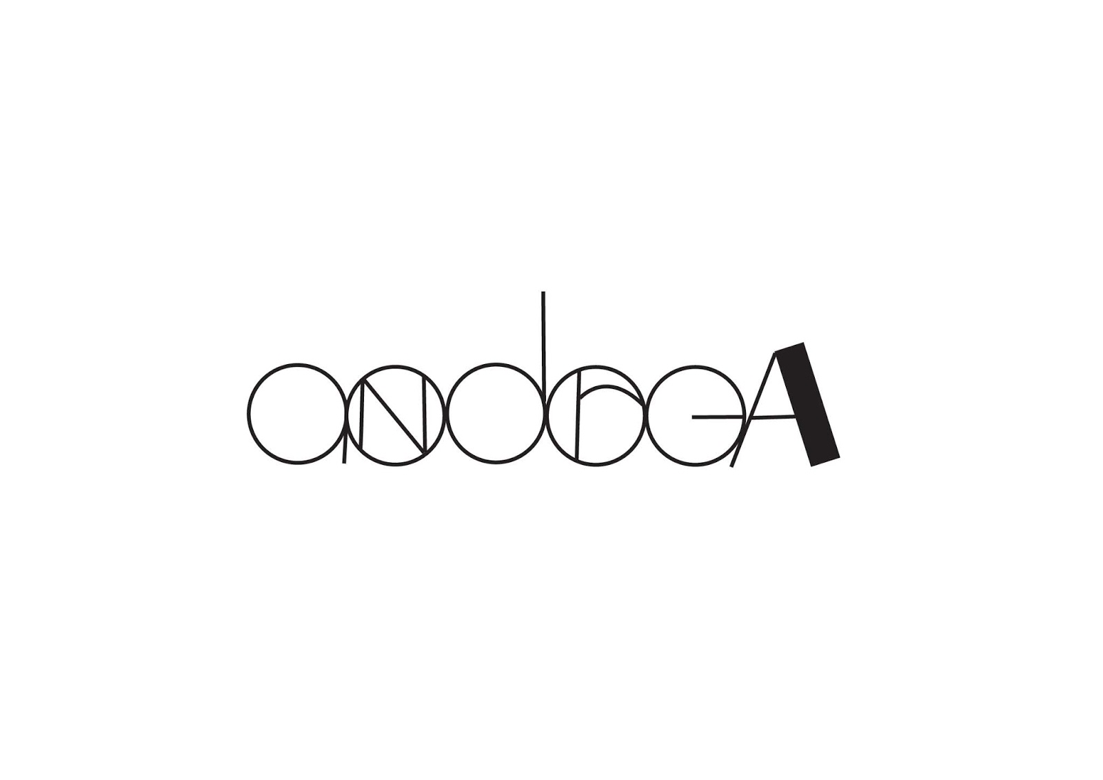
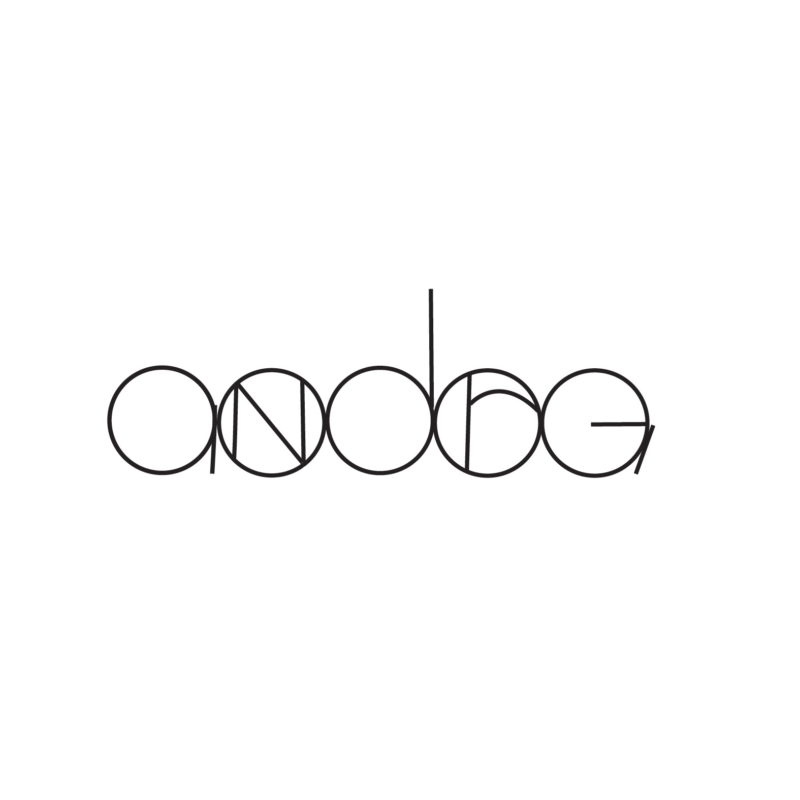
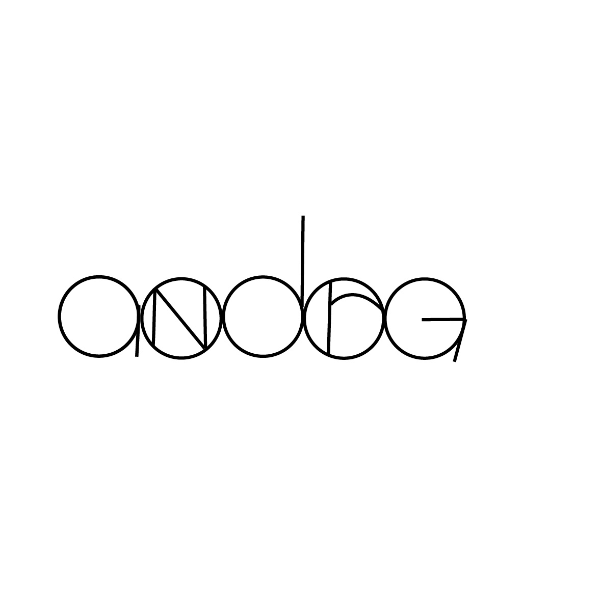
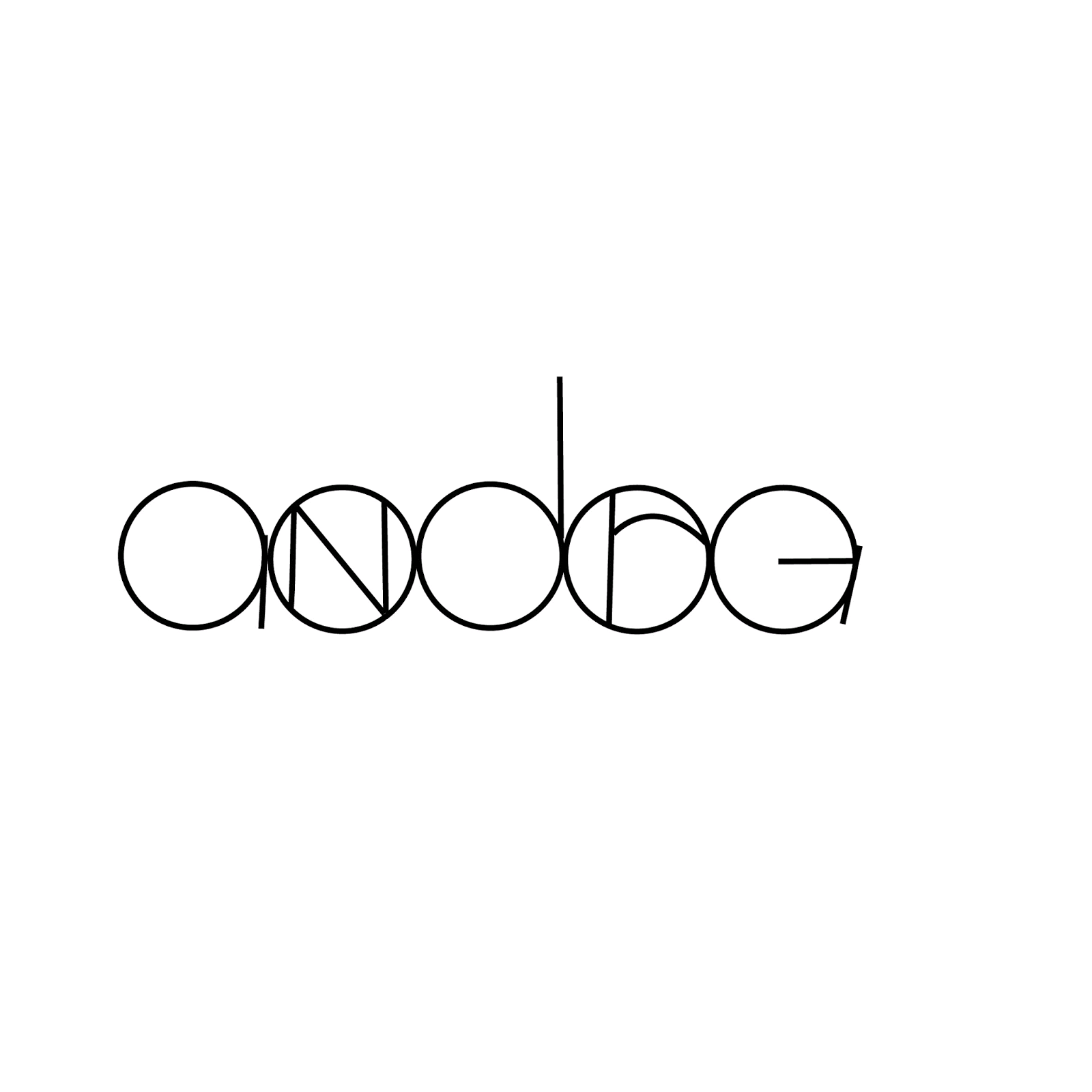
After sketching, I decided to use my last idea sketch as it is easier to digitize and shows more uniqueness.
Using the sketch, I traced the sketch using the shapes and pen tool in Adobe Illustrator.
1st Attempt of Animating Name:
2nd Attempt of Animating Name:
I realize that the animation was not smooth enough so I did another attempt by adding more artboards and it was better than the previous one.
Artboards of Animation (Screenshot):
Final Outcome of Animated Name:
#3 TYPE EXPRESSION (2 WEEKS DURATION)
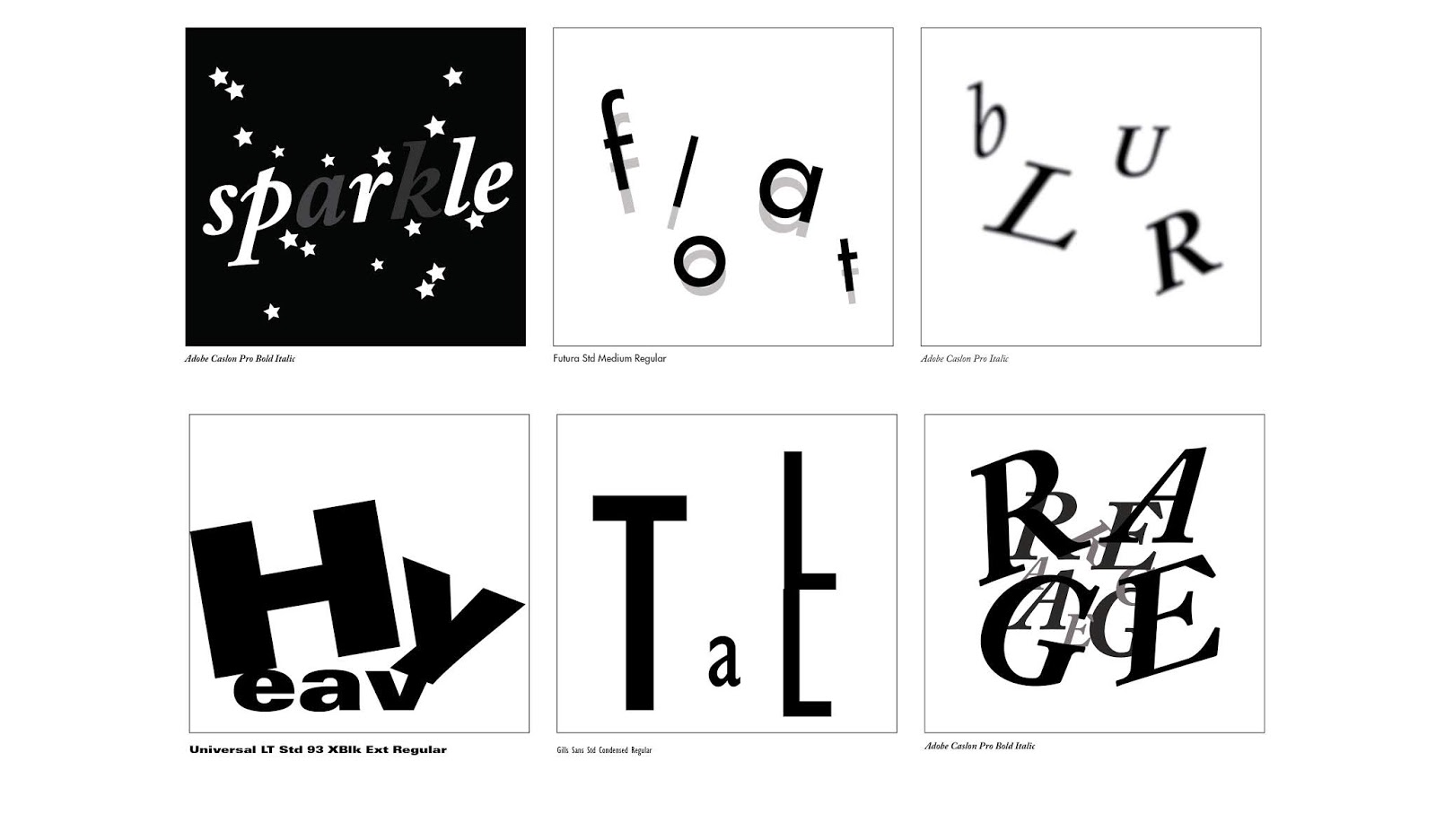
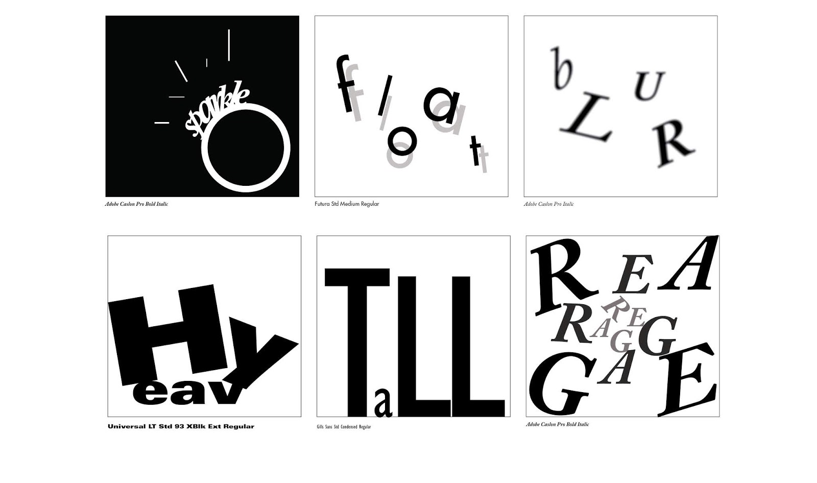
For this exercise, we had to sketch and digitize six words that show its expression. We decide on the six words in class which were sparkle, float, blur, heavy, tall and rage. We were also given 10 type families to choose from to design the lettering of the words.
The ideas had to be in 80x80mm squares, leaving a 7mm vertical and 20mm horizontal gap on an A4 size document.
1st Attempt of 6 Type Expression:
Final Outcome of 6 Type Expression:
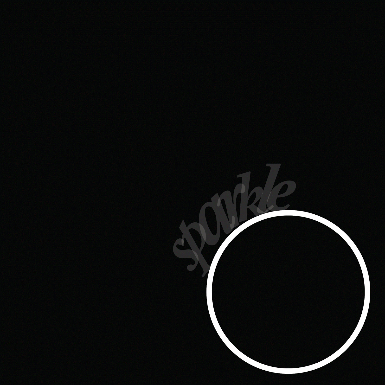
After designing six type expressions, we were asked to choose one to animate it. I chose to do “Float“.
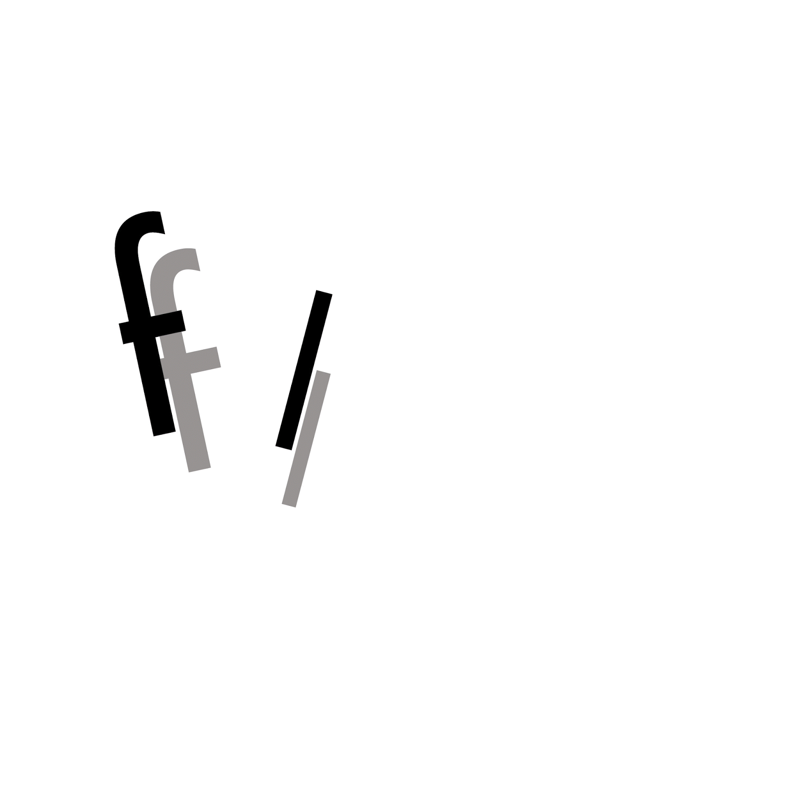
After getting feedback from my lecturers on my float animation, I have decided to change to another type expression, sparkle as it would be easier to animate. I have decided to make the ring lighten up by its diamond which is the word “sparkle” with a few lines to give more effect.
Artboards of Animation (Screenshot):
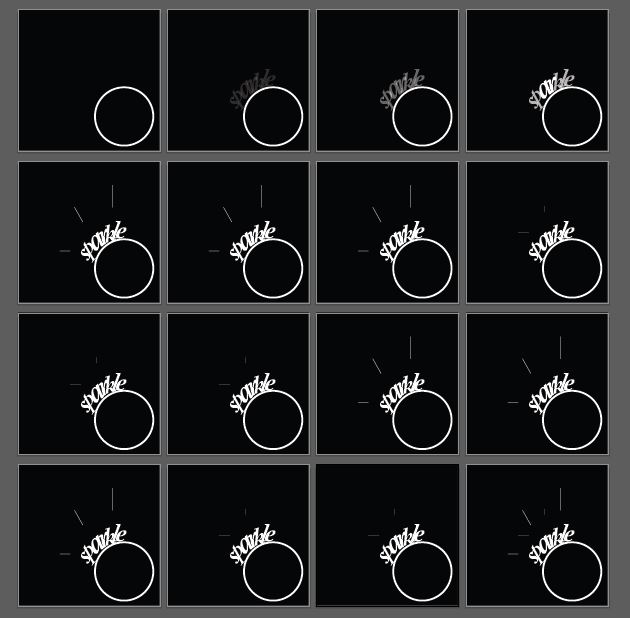
Final Outcome of Animated Type Expression (Sparkle):