SOCIAL MESSAGE POSTER (EXPRESSION, HIERARCHY & COMPOSITION)
We were briefed on our final project, Expression, Hierarchy and Composition. We had to create an A3 poster on any social problems that happen within Talyor’s University campus. Our message has to fill at least 3/4 of the poster with minimal graphics and one colour other than black and white.
I chose to do on a social problem, Respect towards peers, lecturers and staff on the campus.
Before I start to sketch my ideas, I looked at various poster design samples that had good alignment and hierarchy on Pinterest. Here is the link that I saved the poster samples in.
After researching, I moved on to sketch my ideas down for my poster. I added margins, columns and rows to help me with the alignment of the words.
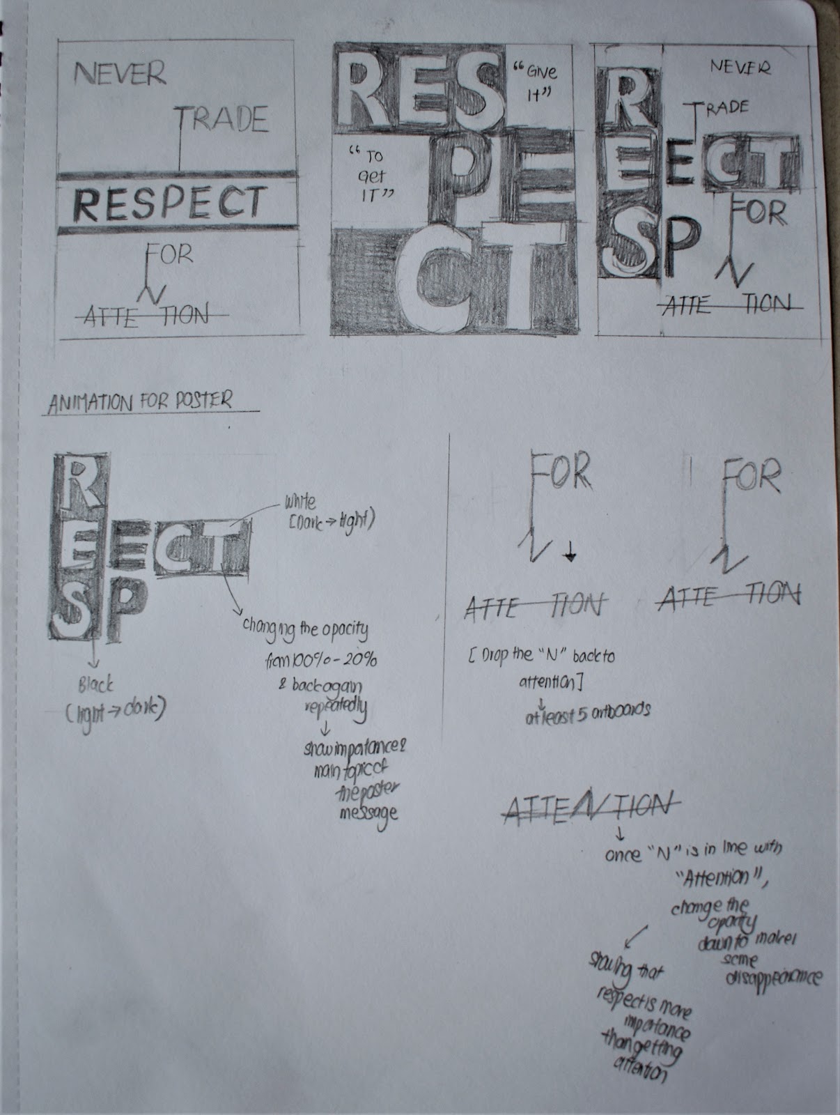
Sketches #1
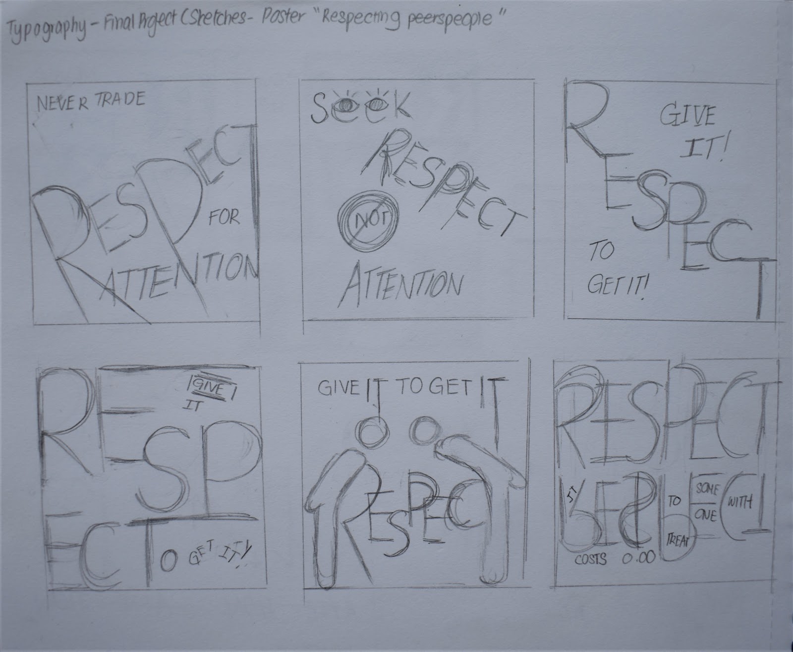
Sketches #2
After sketching my ideas, I tried out some of the sketches I did by digitizing it in Adobe Illustrator.
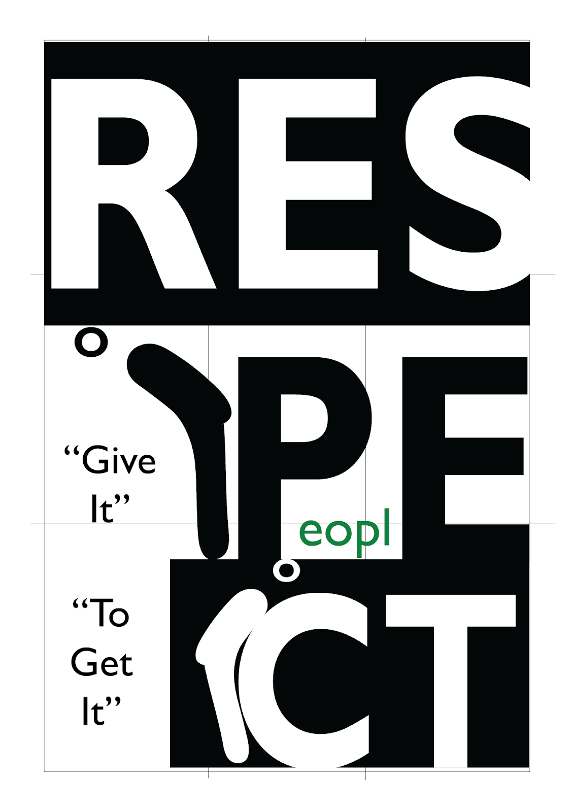
Exploration of poster design in Adobe Illustrator (1st attempt)
andreaviechoong.com andreaviechoong.com
andreaviechoong.com andreaviechoong.com
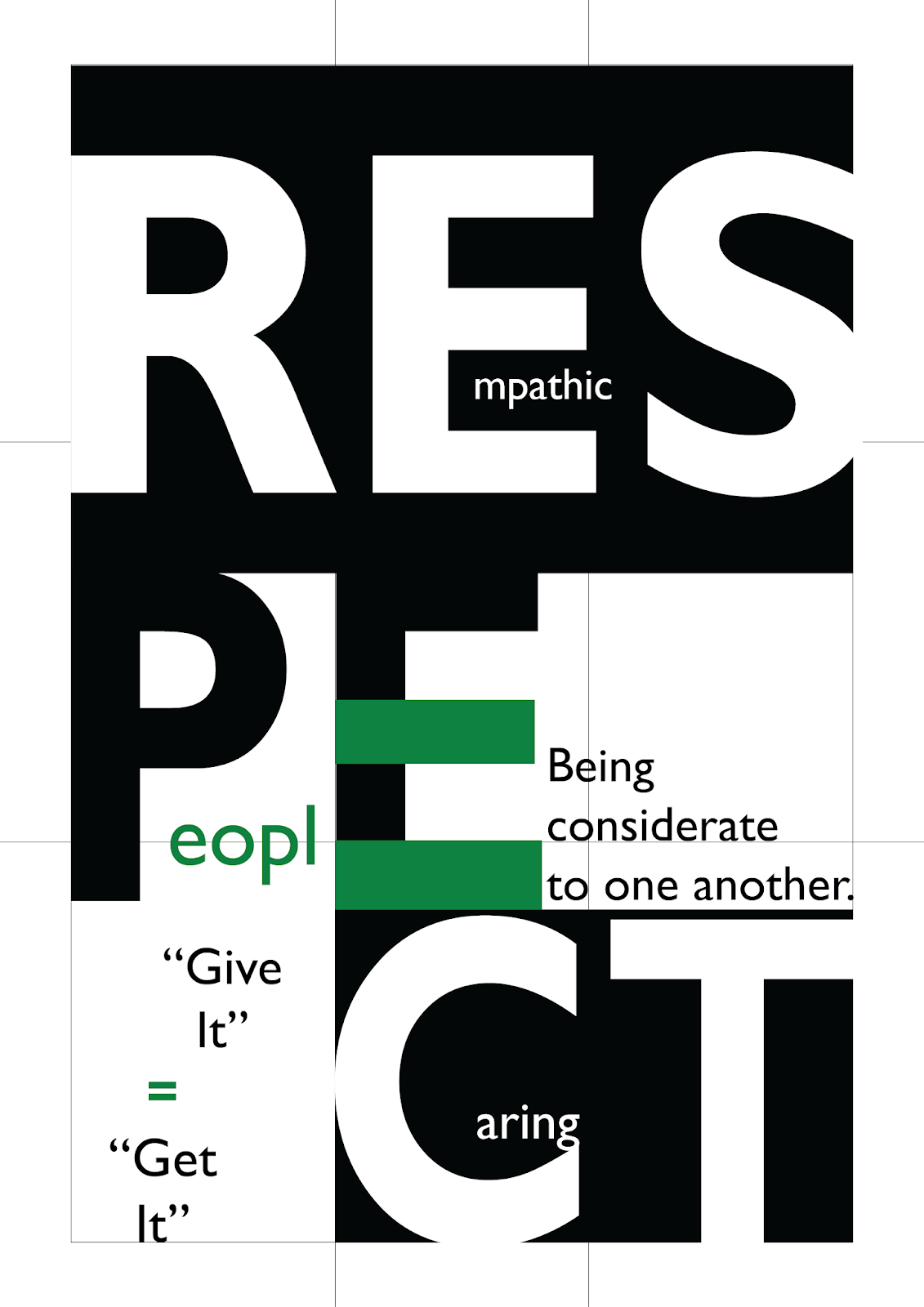
After getting feedback from both lecturers, I realized that my poster design lacks of readability and alignment of my message/text. As well as, my idea of showing the topic, Respect is not clear enough in expressing in type.
I decided to go ahead with the third poster I designed previously as my lecturer suggested me to go ahead with that. I added some hierarchy between each letter from the biggest to smaller to show how important people like elderly people should be respected first. I also added green colour to the word “people” formed by the two letters, P and E. The green is one of the colours that represent Respect.
Final Outcome of Poster Design (2nd attempt)
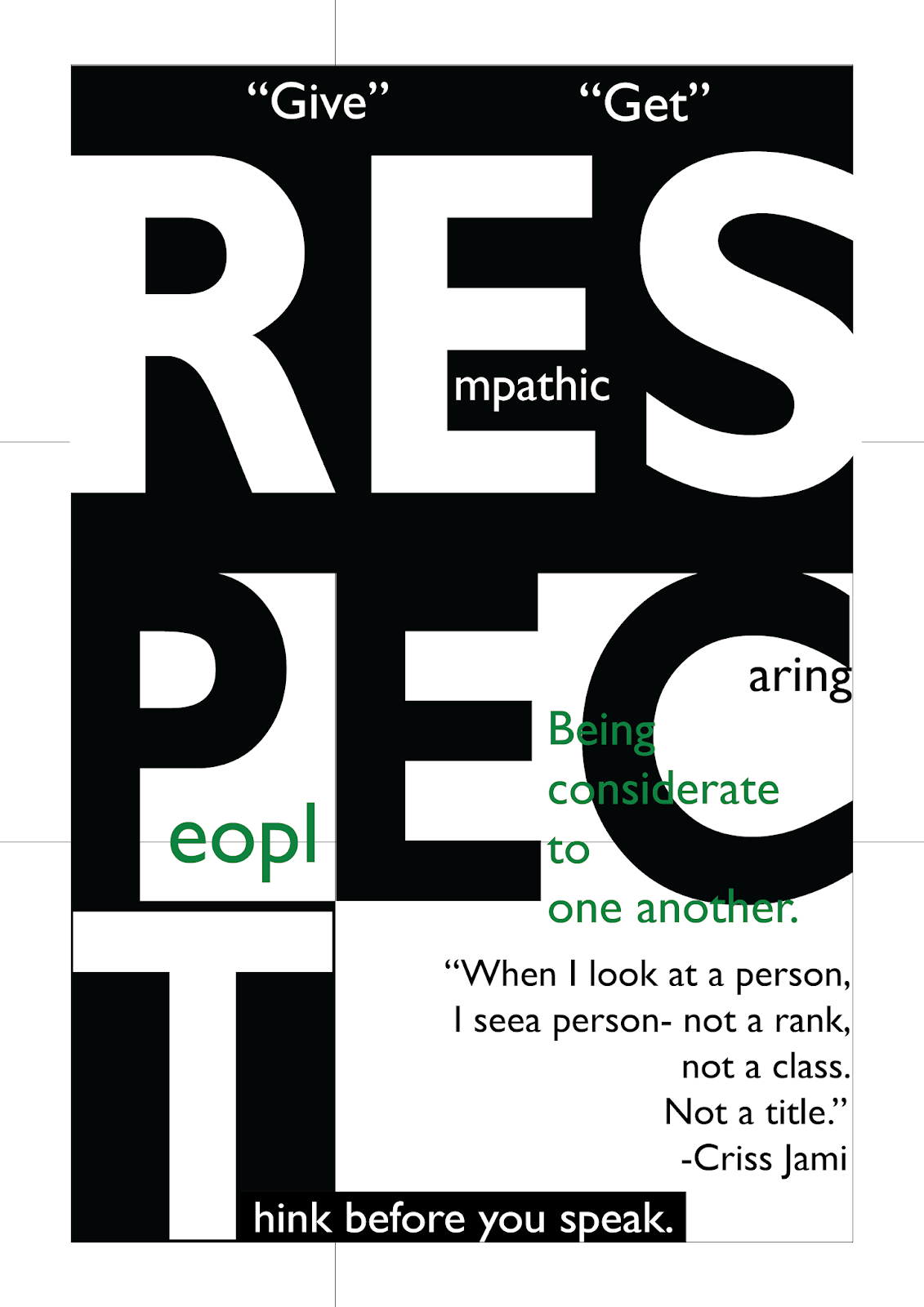
After getting feedback on my poster, I realized that I rely too much on graphics rather on the text. I should avoid that and try of how to express the words instead.
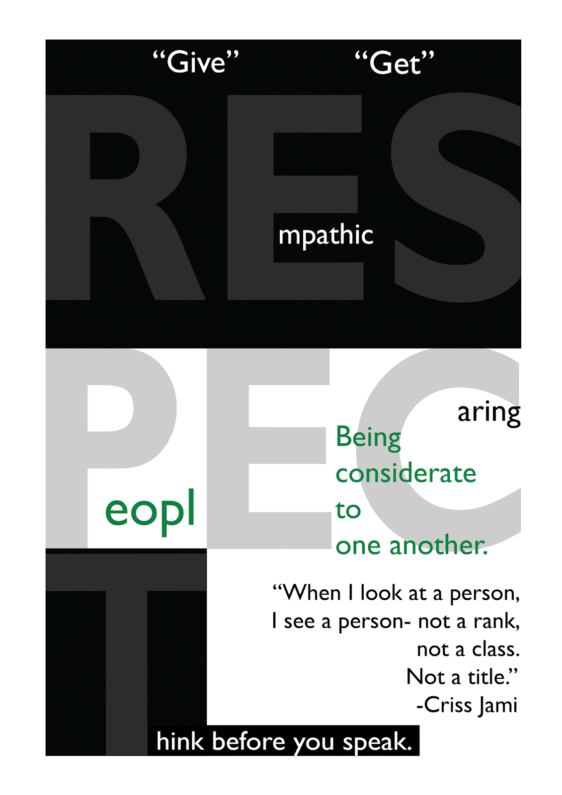
Final Outcome of Poster Design (3rd attempt)
I had to change the arrangement of the letter “C” to make it next to letter “E” and leave “T” at the bottom row to make it more readable. And also to add a text add the bottom to not make it look empty.
Final Outcome of Poster Design (Static)
After creating my poster design, I moved on to the animation part of it where the poster will be displayed on social media. We have to animate the text or words that are necessary in the poster.
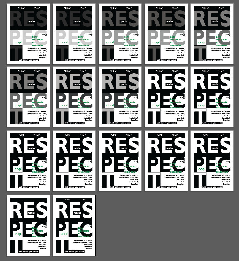
Screenshot of artboards
Final Outcome of Poster Design (Animated)