FONT DESIGN (1 WEEK DURATION)
At the start of the project, I was asked to pick an alphabet or letter from my name initials. The letter should have some difficulty in studying and observe the features. I had to either choose a serif or sans serif font to study on. And later on, use lines and/or circles to construct the letter.
Lowercase letters should be at 500pt x-height and 700pt for uppercase letters. The font can only be in regular or bold.
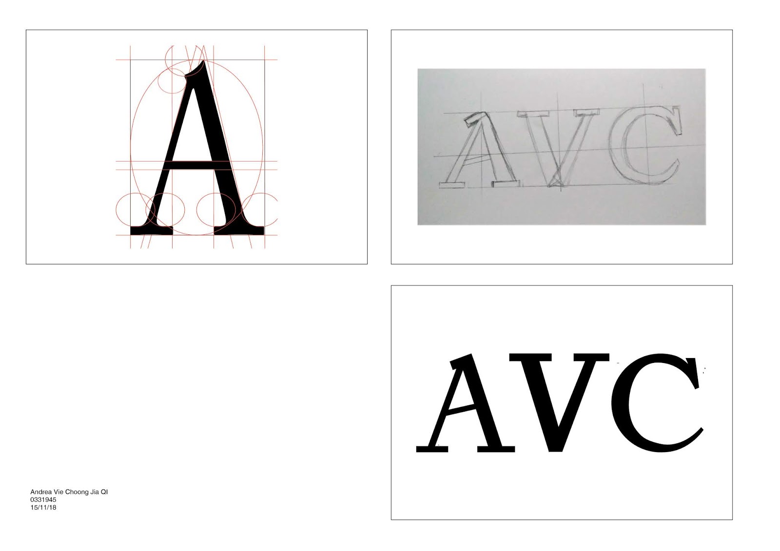
I chose the letter A from my first name “Andrea”. I chose to study and observe on a serif font, Adobe Caslon Pro Regular.
Uppercase “A” study (Adobe Caslon Pro Regular)
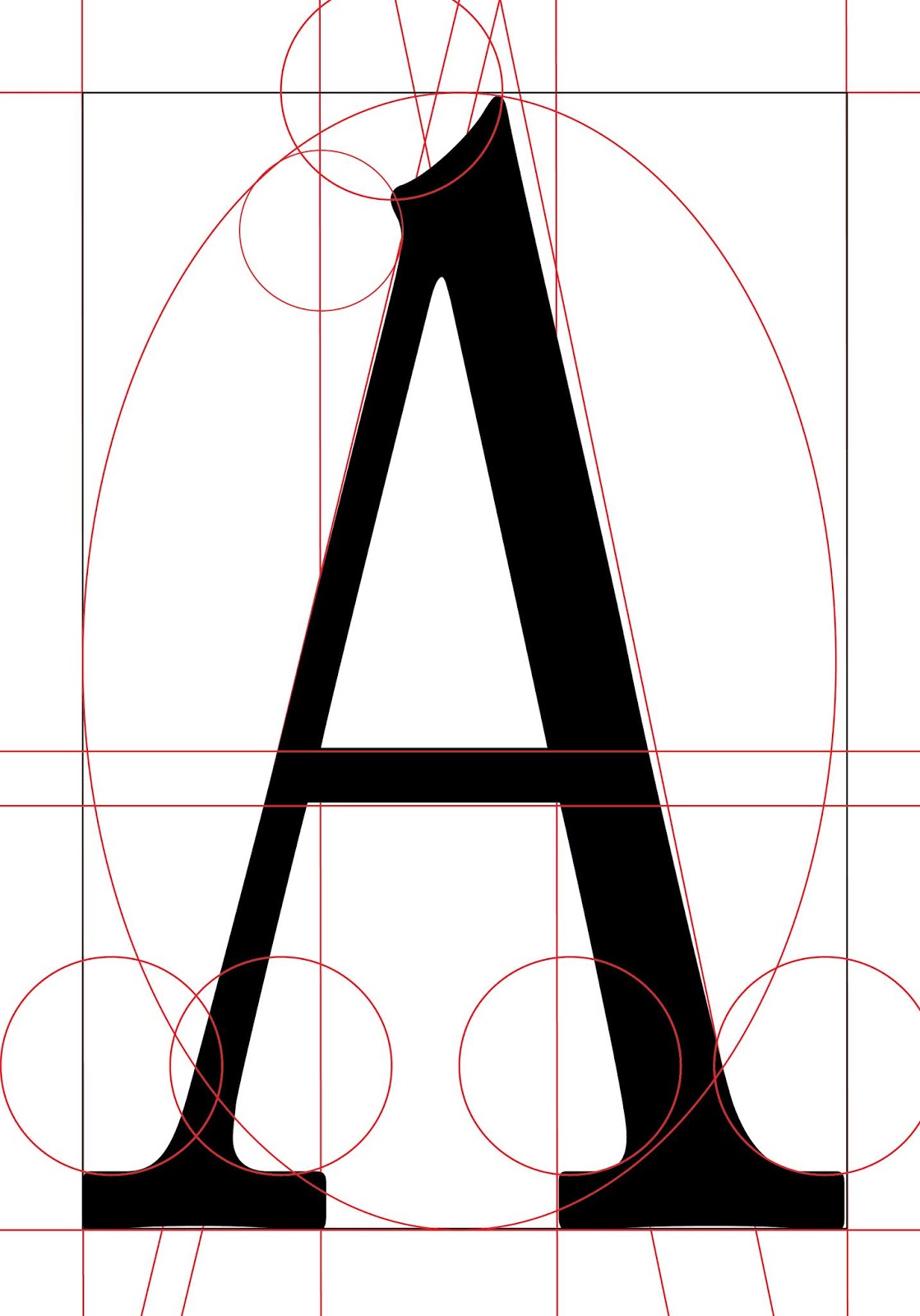
From this study and observation, I noticed that this letter and font has more lines than circles to construct this letter. Lines also include not only vertical and horizontal lines but diagonal as well. A circle can be drawn to show that the letter A is in the right proportion.
After this study, we moved on to another task where we had to study on a certain font and developed it into our own font of our name initials.
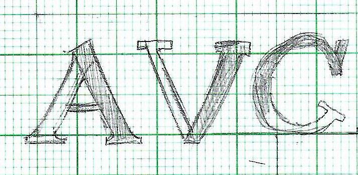
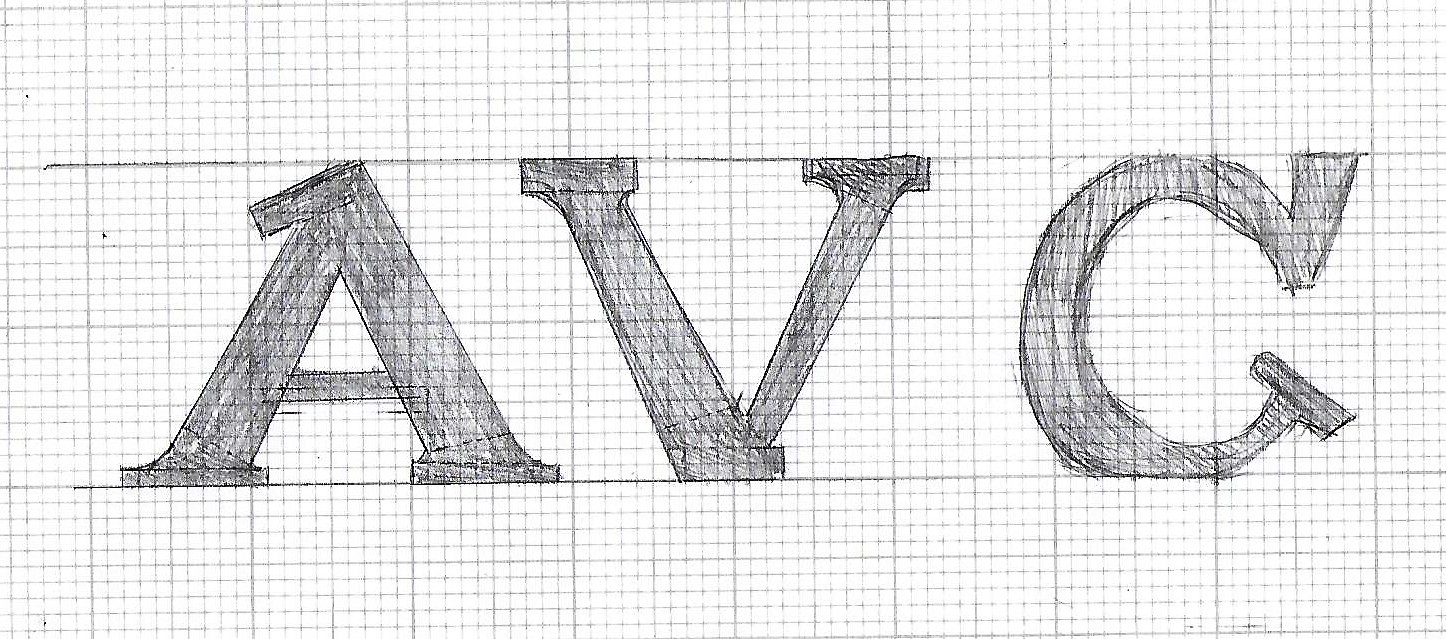
I chose to use Adobe Caslon Pro and Gill Sans MT as references for my font design. I did different sketches by developing this referenced typeface using various strokes and shapes. I used my name initials, Andrea Vie Choong.
Sketches of Initials “AVC”
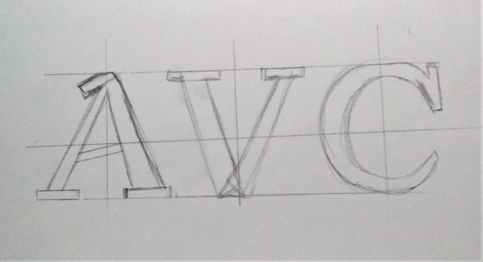
Final Name Initial Sketch (1st attempt)
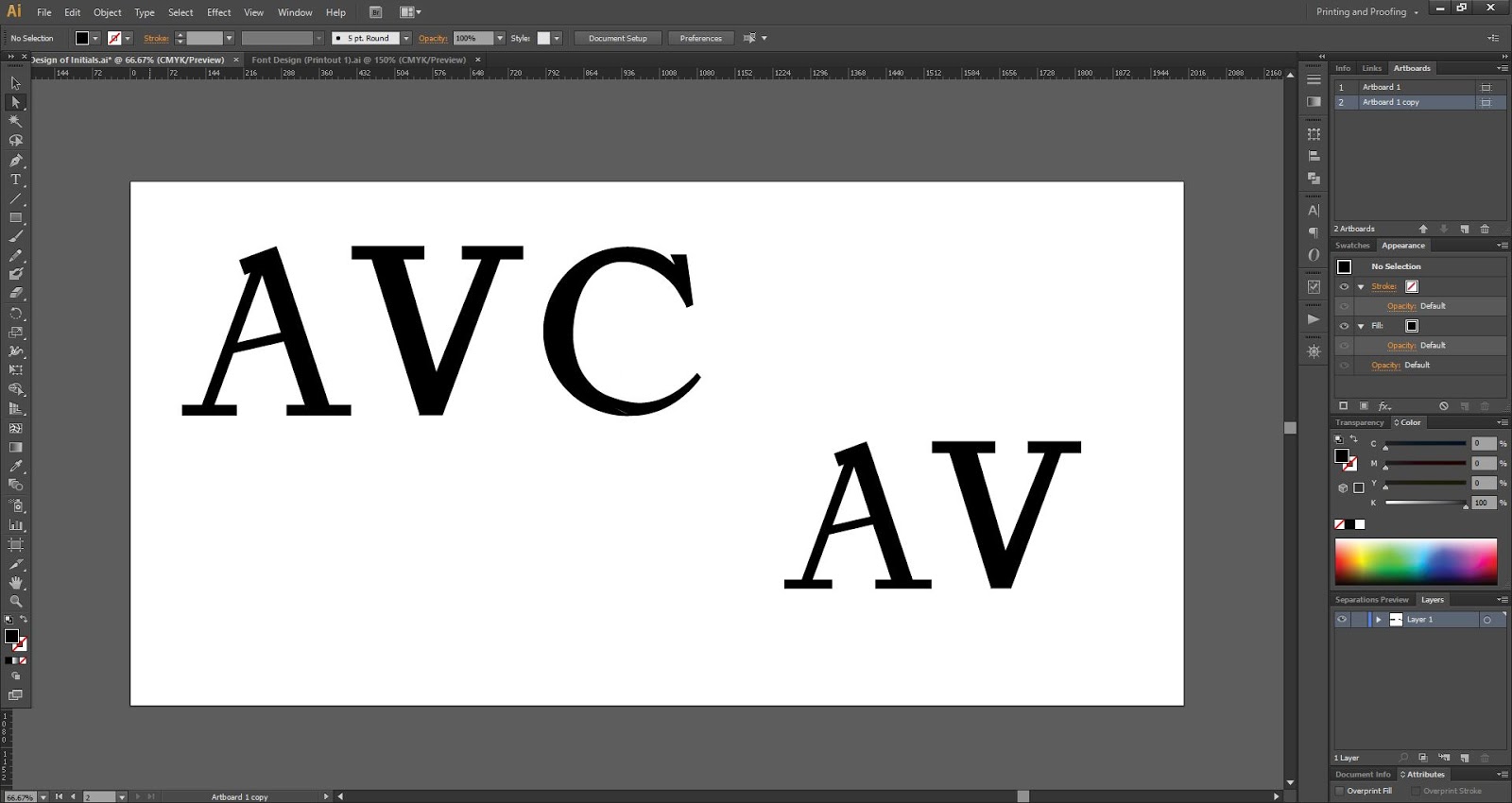
After choosing my final sketch, I digitize it on Adobe Illustrator using the pen tool and the shapes tool.
Name Initial Digitize (1st attempt)
After getting feedback on my font design, I had to avoid changing the stroke width of the original typeface. So I decided to change the style a little by adding a rectangular shape to letter A and V and adjust the stroke back to its originality.
Name Initial Sketch (2nd attempt)
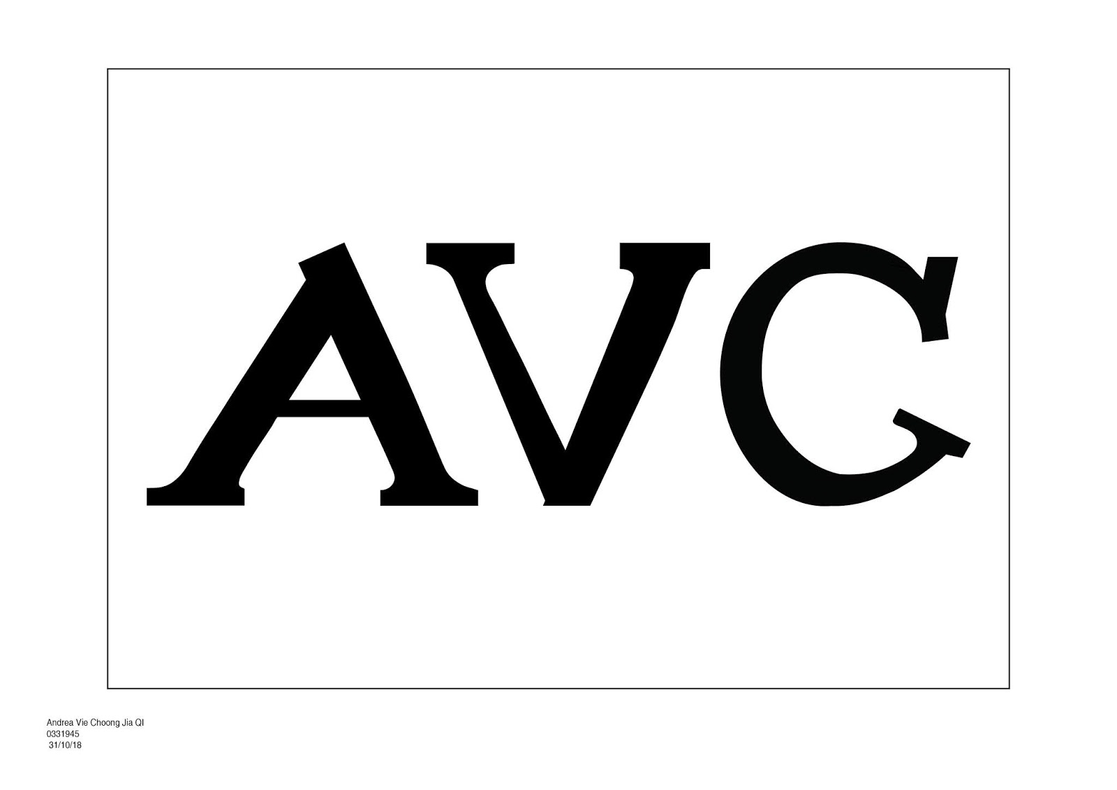
Final Name Initial Sketch
Final Outcome: Thumbnail
Name Initial Digitize (Final Outcome)
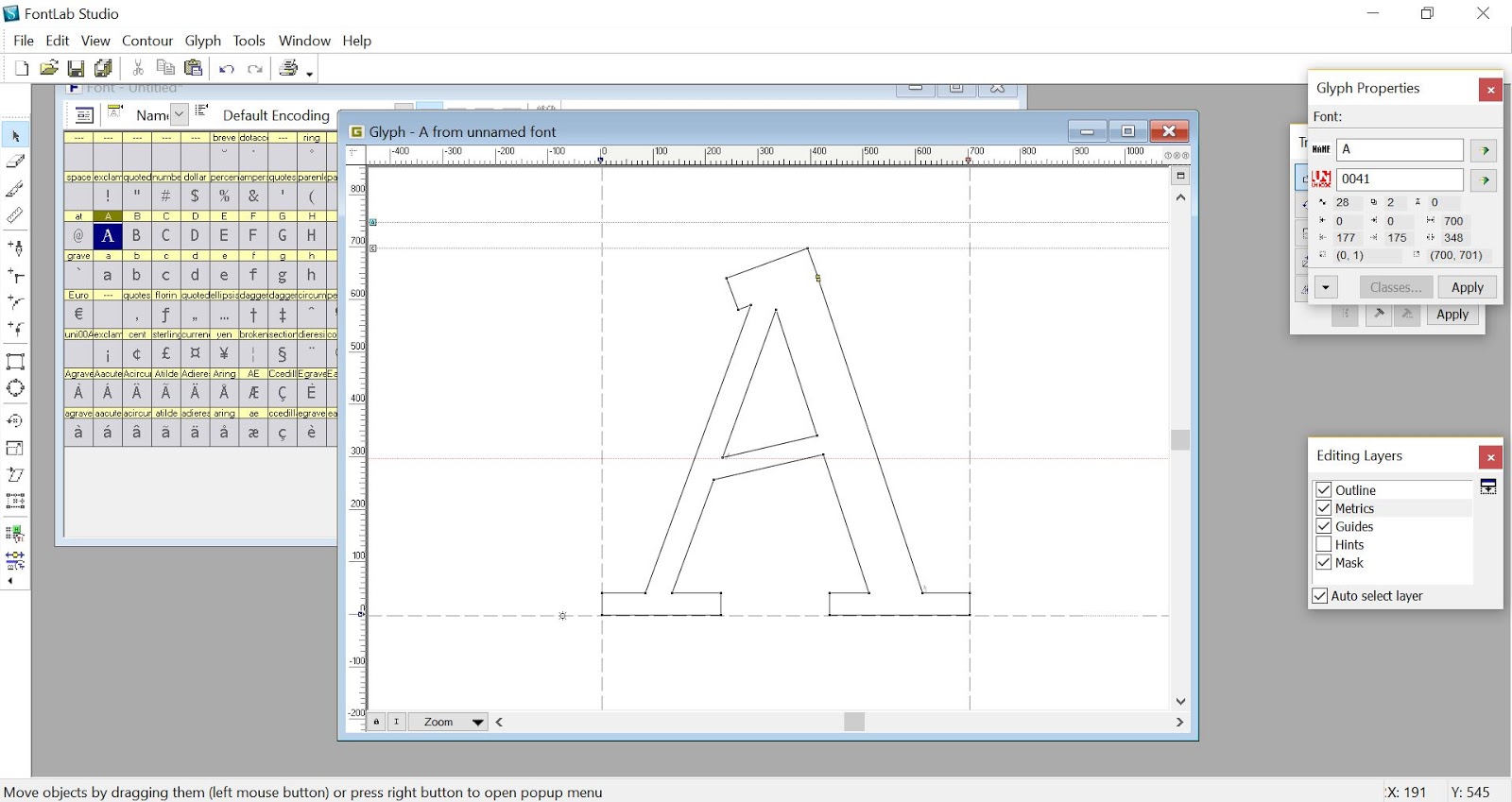
This week, we learned to generate our own digitize font using FontLab Studio 5. Before that, we need to merge all the shapes and lines together so that it becomes one whole letterform.
We had to copy our font design from Illustrator and paste it simultaneously to Fontlab.
Screenshot of the process (FontLab): Letter A
Screenshot of the process (FontLab): Letter V
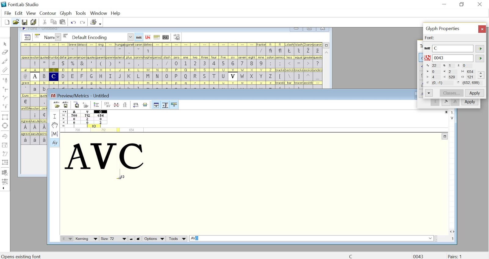
Screenshot of the process (FontLab): Letter C
In order to create the font for the initials, I created a new metrics window and place the three letters together. I adjusted the kerning between the letters to make it even.
Screenshot of process (Kerning)
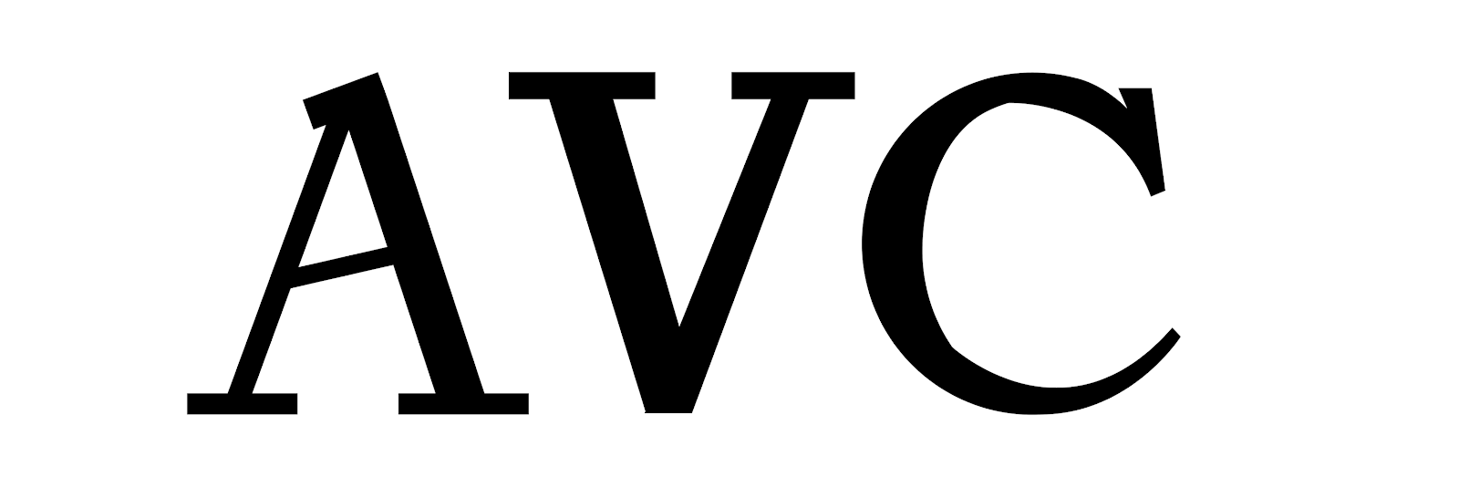
Typing my font in Illustrator