THE TROUBLEMAKER MANIFESTO: A DESIGN COLLOQUIUM - TILE & KEY ARTWORK (2 WEEKS DURATION)
I started this project by looking for an appropriate image or visual as a key artwork or signature artwork to represent or connect on “The Troublemakers Manifesto: A Design Colloquium” with the provided meaning of the event given in the module brief. I am advised to apply what I learned in my previous exercises.
I looked for some references of designers’ designs and works in Pinterest and Google.
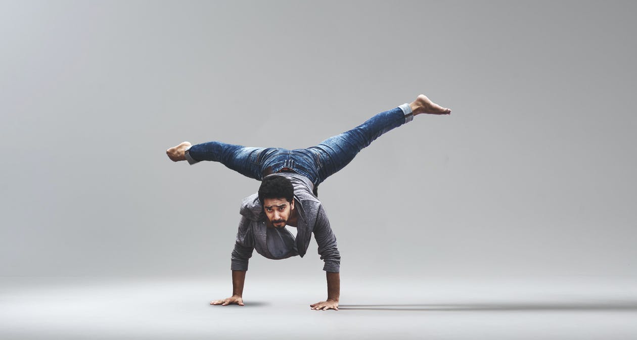
Then I moved on to finding images as key artworks that interpret the content/text well. I interpreted the word “troublemakers” as people who are brave and courageous enough to do things that cause trouble. So I decided to look for an image of a person being brave in doing something. For instance, I found a sportsperson who does high jump. And another image of a male dancer.
Image Elements #1
Removing background from image in PS
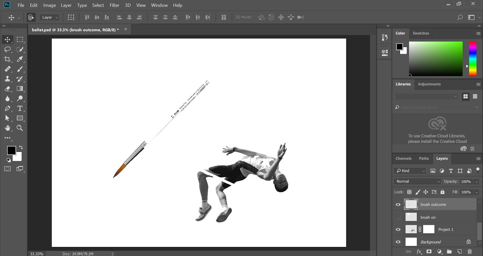
Then I interplay the key artwork with the title. I used the Gill Sans MT as my chosen typeface.
I used the dilatational system for the arrangement of the text for “design colloquium“. The rest of the text is by playing around with the flow of the people’s action. I added the paintbrush to replace the stick that the high jumper jumps over because paintbrush is one of the essential tools for a designer.
Composition #1 (B&W)
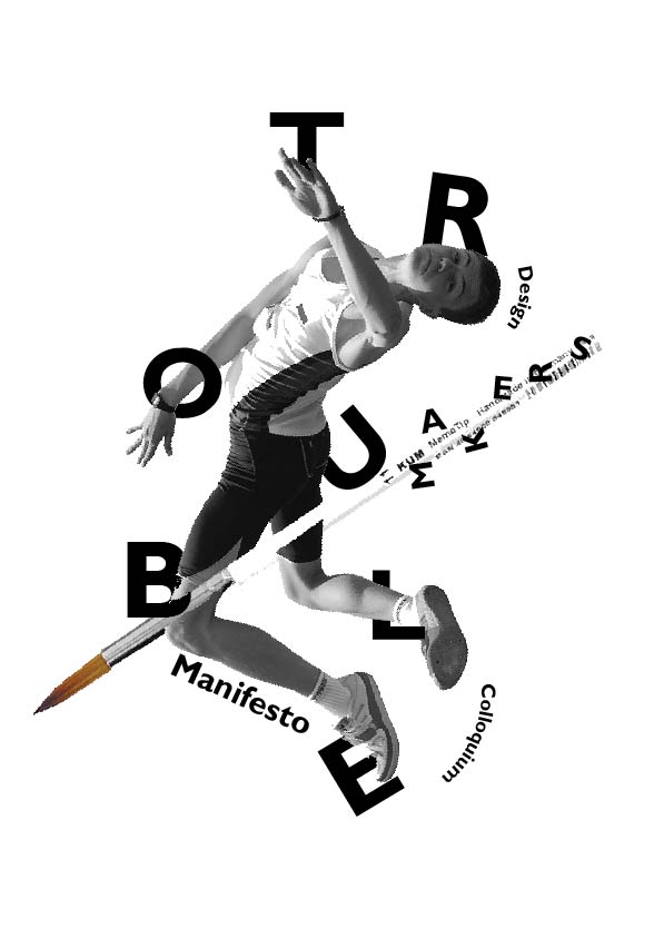
Image Element #2
Removing background from image in PS
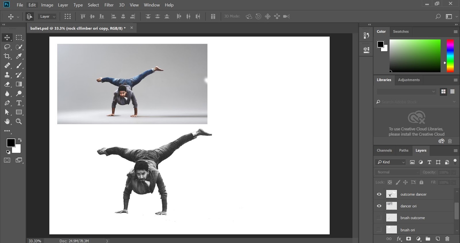
For this composition, I used the grid/modular system on the “A design colloquium and the rest is designed with the flow of the person’s action.
Composition #2 (B&W)
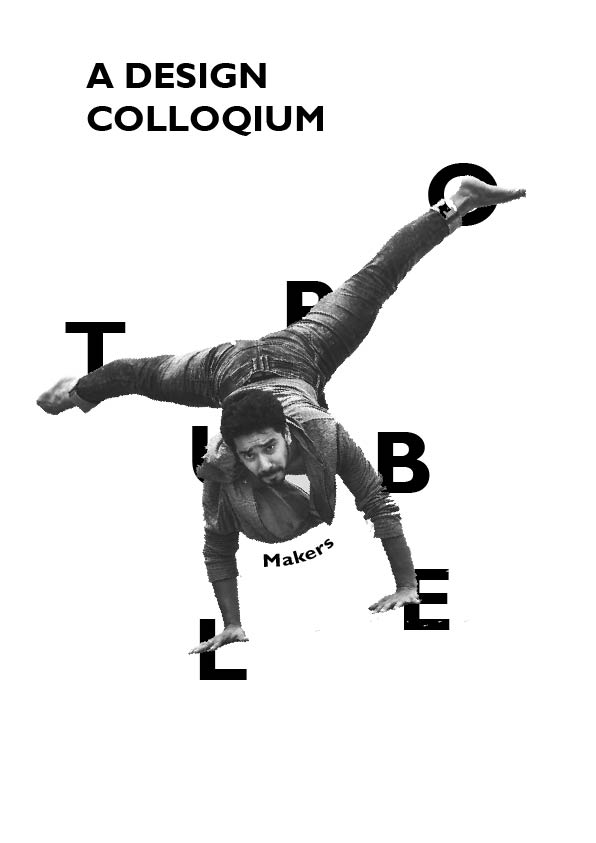
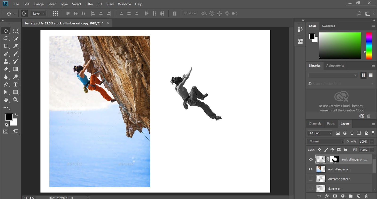
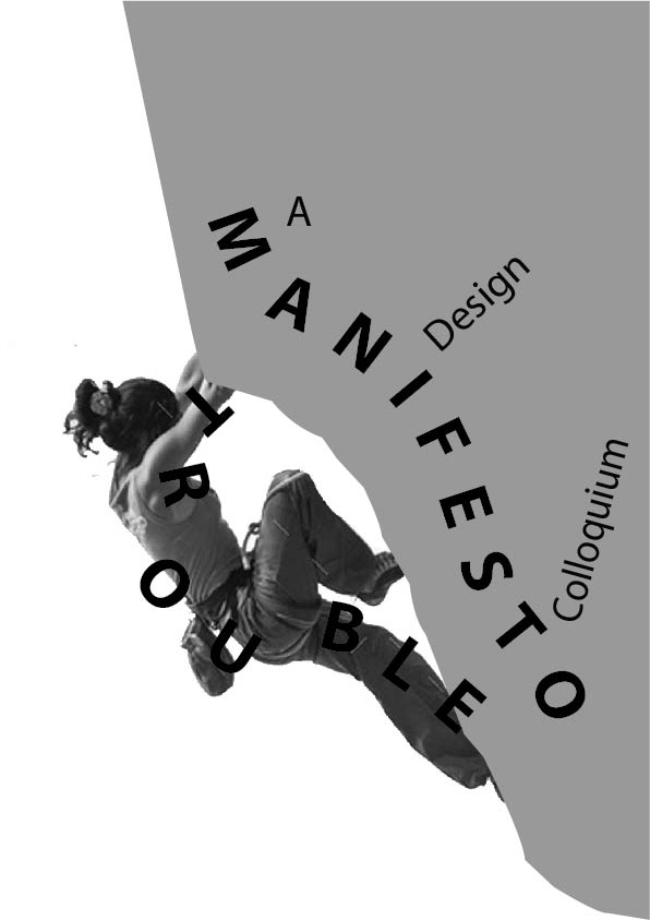
I also found that troublemakers have a trait of being ambitious and impulsive. So I looked for an image as a key artwork to represent this trait. I came across an image of someone doing rock climbing may represent being ambitious.
Image Element #3
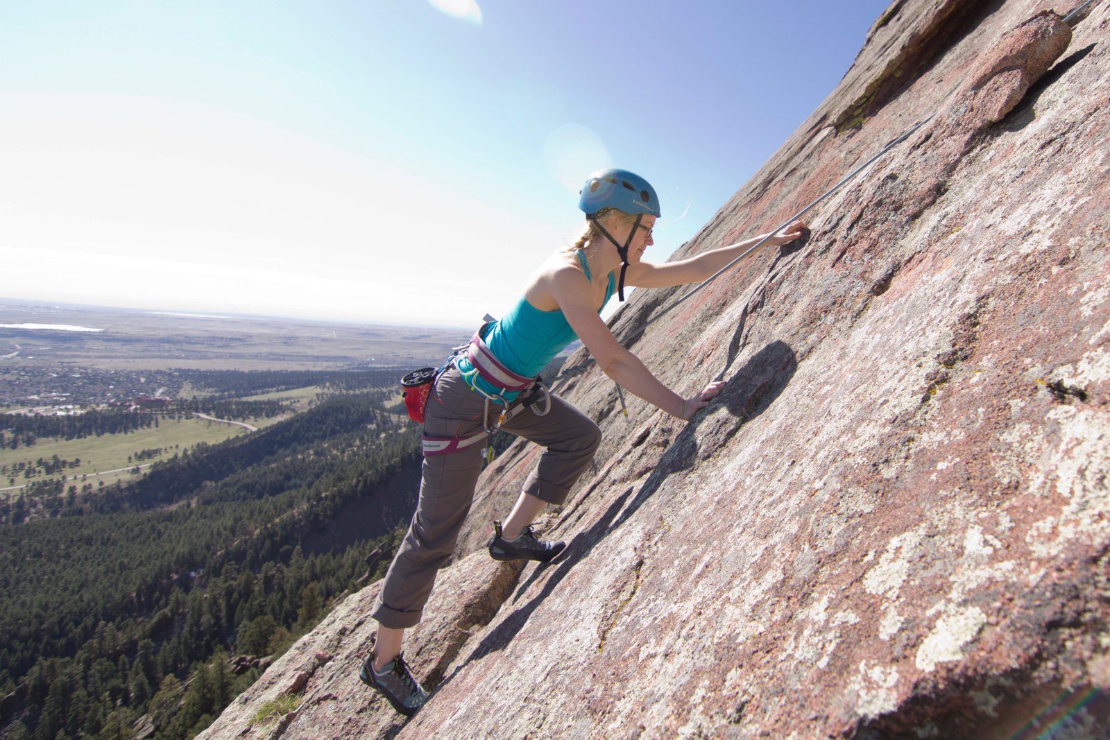
Removing background from image in PS
I used the axial system for the text composition on the rock silhouette and the flow of text follows the flow of the people’s actions.
Composition #3 (B&W)
After getting feedback from my three previous compositions, I had to relate the image to the creative people. So I tried out more ideas and read the meaning of the event again and again to understand the hidden meaning better and clearer. This time, I focus on making the key artwork first before adding the text.
I chose the boy with the straw glasses and magnifying glass images to show the mischievous personality in him. I added the red and white tape around the drink to show that we have to be cautious around this boy.
Image Elements #4
Composition #4 (Coloured)

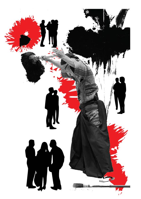
While thinking about creative types of people, I thought of artists. So I looked for some artist images that best express trouble making painting. So I came across this image of a Japanese artist that paints on a blank wall using the Japanese calligraphy technique. I added some silhouette of people and made them smaller than the artist because troublemakers tend to stand out more than other people.
Image Elements #5
Composition #5 (Coloured + B&W)
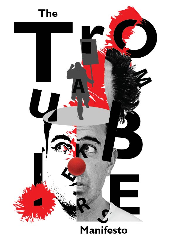
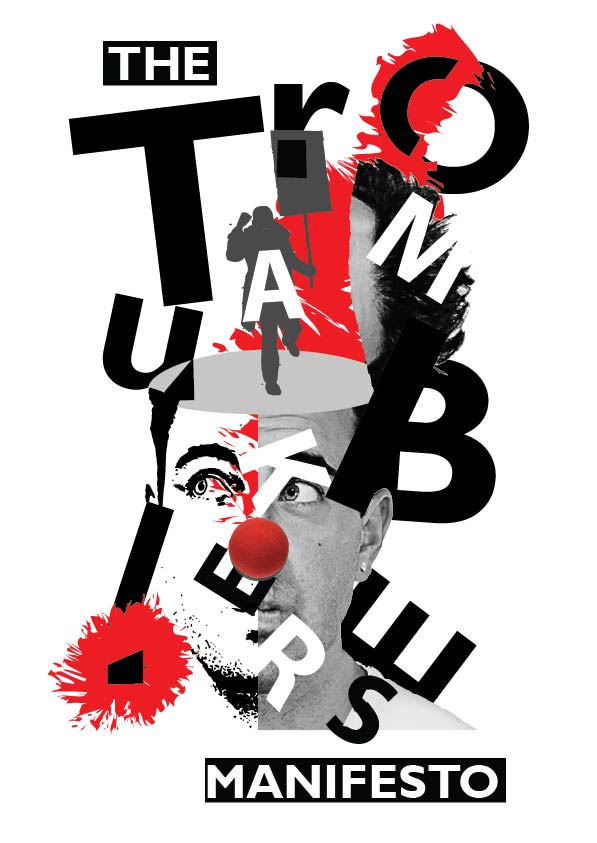
After that, I came across another idea of using a protester to represent the troublemakers. I was also inspired on one of the illustration that might help with my composition. I wanted to show how a designer is a troublemaker by its protesting mind. I also found that a clown’s red nose can represent trouble as well.
Idea Reference
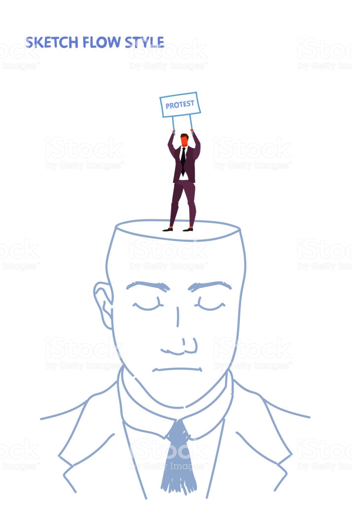
Image Elements #6
Composition #6 (1st attempt)
After receiving feedback, I had to explore more in terms of the composition. I started to play and explore with the word “makers” around the clown-like human and silhouette.
Composition #6 (2nd attempt)

Composition #6 (3rd attempt)
Composition #6 (4th attempt)
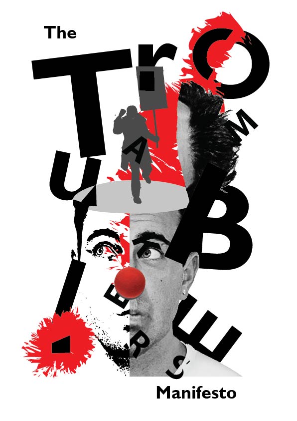
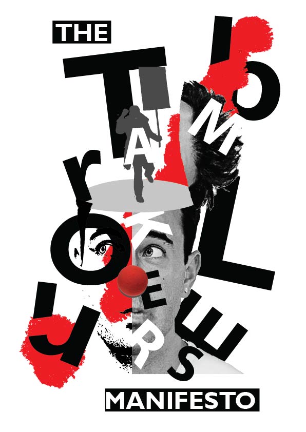
I choose to go ahead with the 4th attempt of composition #6. I had to make the title “Troublemakers Manifesto” more readable. So I ask some of my friends that are not designers, they say it is difficult to read the “Troublemakers” and it is too scattered. One of my friends suggest that I could put the letters “TROU” to the left and “BLE” on the right and leave the “makers” in the middle.
Composition #6 (5th attempt)
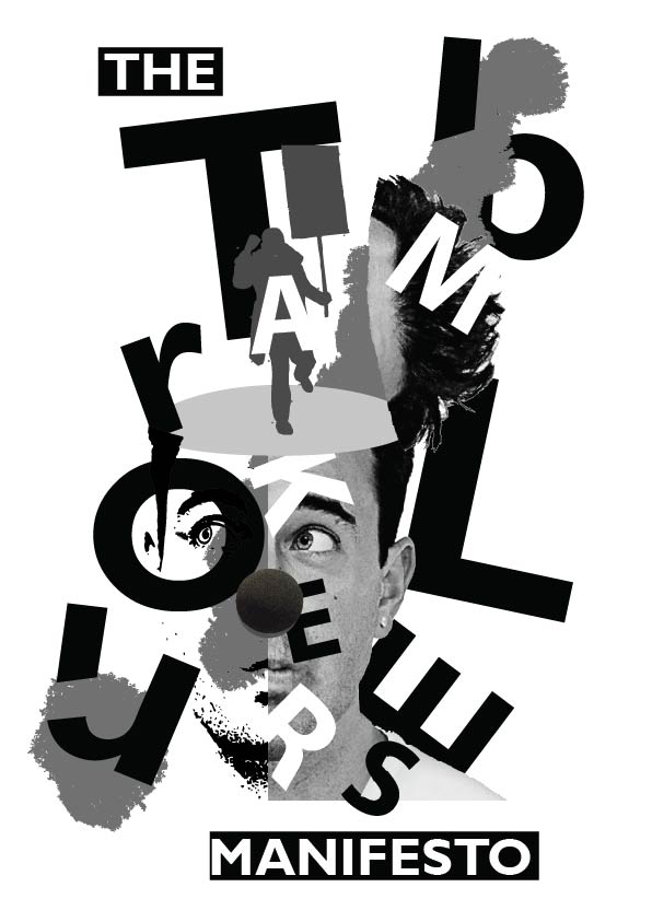
When I made my poster in project 2, I was asked to change the exclamation mark stroke to a more soften brush. After that, I changed the artwork to black and white as well since we need to submit it as our finalized work.
Final Artwork- Coloured
Final Artwork- Black & White
CONTINUATION OF THIS PROJECT IS PUT FORWARD TO PROJECT 2 (CLICK ON BLOG POST BELOW TO VIEW)