As I mentioned from my previous blog post on my final project research, I have decided to do Graphic/Communication Design for my future degree. Here are five final photos that I have chosen. For these five photos, I chose five different objects and place a typography on each of them with background props to enhance the appearance.
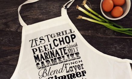
These are the final chosen typography that I used in these final photos.
Concept 1: Music as a form of relaxation
In this photo, I used a blue checkered cloth as the main background for the composition. In the composition, it contains various shades of brown and white which contrasts with the blue background. The effect of the photo gives it a relaxing and comfortable feel. I have drawn the typography onto a plain notebook which random music terms and a quote “Where words fail… music speaks”
Shutter speed: 1/100, Aperture: f/4, ISO: 200
Concept 2: Violin with colourful paper cranes and fruits
In this photo, I used a Chinese red flower and dark brown cloth as contrasting backgrounds to enhance the appearance of the props. The typography ” live simply, laugh often” tells that we need to live a happy and joyful life instead of filling it with misery. I added colourful fruits and paper cranes to represent as happiness and joy.
Shutter speed: 1/100, Aperture: f/4, ISO: 400
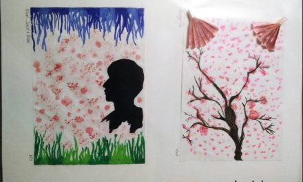
Concept 3: Art & Design
In this photo, I include my IGCSE artwork and a plain black background to create a difference in texture, one with more details than the other. I added soft pastels and a pencil to create a better composition to represent the typography “Let your soul shine”
Shutter speed: 1/100, Aperture: f/4, ISO: 200
Concept 4: Colourful ingredients against a one coloured dish
I used several ingredients to enhance the simple Chinese food dish with a pair of chopsticks. I used a darker backdrop to bring out the appearance of the main objects and other props. I decided to take from a top view as it displayed all the props displayed in the composition. This matches with the typography “eat well”.
Shutter speed: 1/100, Aperture: f/4, ISO: 400
Concept 5: Close up on food details
In this last photo, I used the same dark backdrop but I changed the main food dish into a green vegetable dish and two simple ingredients. I tried this taking in a close up view. I wanted to focus on the garlic details and the typography “eat well”
Shutter speed: 1/100, Aperture: f/4, ISO: 400
And finally! I have completed all my assignments for Introduction to Photography. Throughout every assignment, I had challenges and difficulties when adjusting the settings to take photos. Especially in this final project, it was not easy to add and adjust the typography into the photos so that it would blend in the photos. I had to plan out the composition and angles when taking these photos.
It took a while for me to get used to doing close up shots which I have never done it before using my camera but I was comfortable in wide angle shots.
Throughout the number of weeks spent, I managed to overcome these challenges and do my best in this project. I believe that I have improved my photography skills for now and hope to gain more knowledge by taking photography as a hobby.

